surf's deviant has a tutorial on a background layer that blends the focal point a bit into the background.
your latest one's render stands a bit too solid in the sig, surfs tutorial should make it loads better
your latest one's render stands a bit too solid in the sig, surfs tutorial should make it loads better
-=Art is never finished, only abandoned=-

Originally Posted by Freelancer

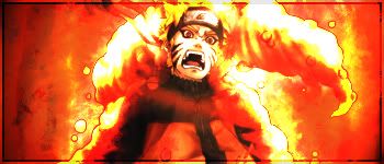
First sig with Naruto is way too simple. Don't rush art, you'd need to work at least 1 hour on each. What you did with Naruto is just lighten up and use different layer settings, and some editing... Try to add depth to the signatures, here's an example I did about 4 years ago;

That's a nice sig. I'd love to be able to make one like that. I'm currently learning on backgrounds and flow.
Originally Posted by BenDover
surf's deviant has a tutorial on a background layer that blends the focal point a bit into the background.
your latest one's render stands a bit too solid in the sig, surfs tutorial should make it loads better
I thought so too. I wanted to put more contrast. I'll definitely go check surf's tutorial. Thanks for letting me know there's such a thing
Originally Posted by Dex
I actually like it
Thanks. I'm still improving.
Any chance anyone knows surf's deviant link? i can't find it in the deviant index thread.
Last edited by raiden224; Jul 12, 2010 at 03:11 PM.
|Cube | Sphere | Cylinder | Torus|
Youtube channel for the shits and giggles
Youtube channel for the shits and giggles


i tried blending by bluring and low opacity eraser to try to slowly blend it to the background. how is it? i know the background's horrible. just working on the transition.
I'm still looking for surf's deviant. If anyone has it. I would appreciate if i can have it. Thanks.
|Cube | Sphere | Cylinder | Torus|
Youtube channel for the shits and giggles
Youtube channel for the shits and giggles
 9/10
9/10