Ranking
Original Post
[TEX] Experimenting with joints - Robotic set
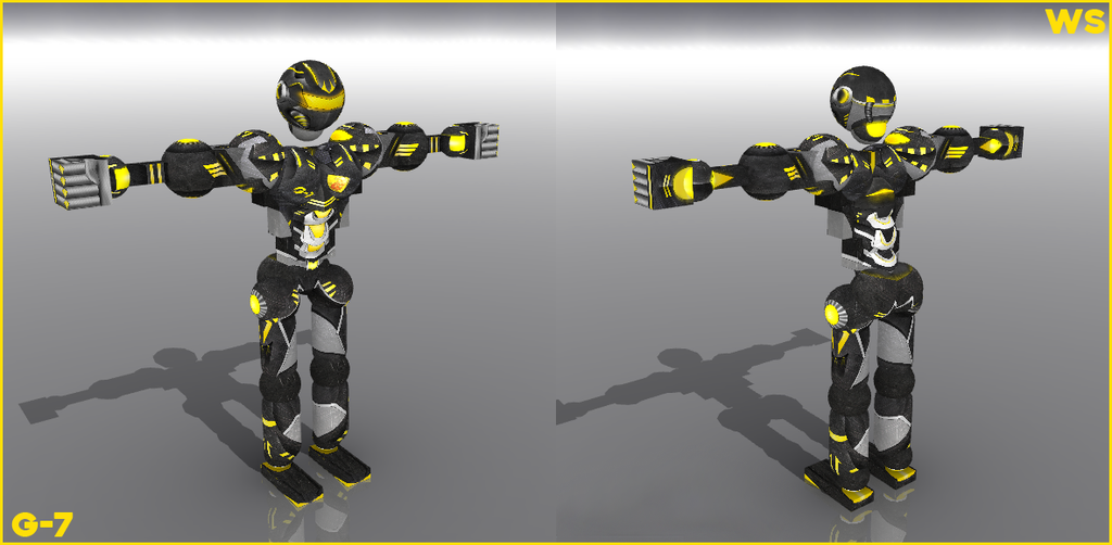
My 'first' time doing joints ( I did a little of neck, chest, lumbars and abs in the past, but with very simple stuff). This was a request from a friend he said he wanted Robotic and lots of shiny yellow + black.

WIP


Still gotta fix a couple of things, like how the neck wraps around the back and the lower part of the bicep that isn't properly mapped.
CnC welcome and much encouraged.

WIP2


WIP 3


WIP 4


Software used: Photoshop CS6
Last edited by Wildslash; Dec 21, 2015 at 12:13 AM.
This is really good. I like the neck as much as you did, but it seems that pecs/shoulders aren't really connected, looks kinda odd. The other parts are coming out really good. Also, could you post a straight frontal picture? Can't see the head very well and give an opinion from these angles.
this looks sooooooo good for a first time! really good job!
2 problems one is the top of the shoulder where the bicep and shoulder meet there appears to be a seam i think that would be an easy fix.
2nd thing on the back the shoulder and the pecs dont fade into eachother again pretty easy fix and if you dont want to it makes no difference thats just my opinion.
all in all its looking super good!
|Jacklox2| |Frost| |MrBeany| |Nugget| |Sheetboy| xFIRExGAME |
Originally Posted by XYLONN View Post
This is really good. I like the neck as much as you did, but it seems that pecs/shoulders aren't really connected, looks kinda odd. The other parts are coming out really good. Also, could you post a straight frontal picture? Can't see the head very well and give an opinion from these angles.

Originally Posted by KDigityDog View Post
this looks sooooooo good for a first time! really good job!
2 problems one is the top of the shoulder where the bicep and shoulder meet there appears to be a seam i think that would be an easy fix.
2nd thing on the back the shoulder and the pecs dont fade into eachother again pretty easy fix and if you dont want to it makes no difference thats just my opinion.
all in all its looking super good!

Tried to fix the pec/shoulder issue. I made the background darker so the pec plates don't feel so lost and just hanging there. I tried to avoid pec-soulder connections because they both rotate a lot.
Got rid of the grey line on the shoulder/bicep connection as well.

Thanks for all the insight.

Originally Posted by Demon View Post
god damn i don't know how to cnc art very good but this is godly


Originally Posted by Gbleek View Post
I think this is decent, but I know you can do better with time. Keep working at it!

Originally Posted by xFIRExGAME View Post
very nice i would buy for 500k if i have tc :c


Thank you very much.


Originally Posted by Turtle View Post
This set is awesome! If you ever sell it I would like to offer 145k.

Thanks, unfortunately it was requested by a friend


Updating with full frontal and back views. Wrists + hands almost finished. Maybe tomorrow I'll upload chest + torso if I get the time to work with it.

WIP2

Head looks cool, visor seems extremely compressed, it looks odd to me. I like the idea of the pipes linking with the neck joint at the back of the head but I think you can work on it. It would also look more promising if the pipes were linking to something(?). At the moment, it looks like it's connecting to those 2 rhombus-shaped things..?

From the bicep to the forearm, things are looking great, I'm especially fond of the circular gear looking thing above the elbow joint. But I feel like the bicep and the pecs can use a lot more work. The biceps and pecs just don't flow together, they look out of place.

You started off great with the head, i like the design of it besides the fact that the pipes and visor look a little funky. I suggest adding a lot more robotic stuff - gears, pistons, engines, wires, etc. Adding something similar like Iron Man's arc reactor would be cool too. You don't have to make the gears and etc all distinct but you could just hint it because from what I see now, it looks like a construction set. Layers of metal sheets with neon light illuminating is what I had in mind when I opened this thread.

Chest refs

I'm not sure if someone said that s yet because I don't feel like reading.

The textures look very nice, but they don't really compliment each other. They look very disconnected. Especially the chest area. Not the chest joint but the chest area
Tree