


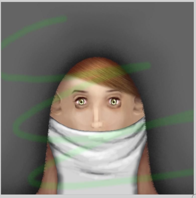
I love the way how smooth the shading on the face is
However, it is to weak ,a bit darker on the whole thing and it few thing would pop out more
Like the nose , it just looks plane to me
The ears are my least favorite part , they are not only light on shading , but also they look embedded
The eye part and the hair is great
But the hoodie, which covers ~60% is to empty , it's just boring to look at
Last edited by Jaker; Mar 12, 2017 at 09:55 AM.
Originally Posted by Jaker

I love the way how smooth the shading on the face is
However, it is to weak ,a bit darker on the whole thing and it few thing would pop out more
Like the nose , it just looks plane to me
The ears are my least favorite part , they are not only light on shading , but also they look embedded
The eye part and the hair is great
But the hoodie, which covers ~60% is to empty , it's just boring to look at
Thanks for the cnc! Will consider everything you said, much love.
-----
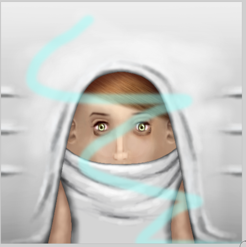
New version.
IMAGE
Last edited by Hypersaint; Mar 12, 2017 at 12:52 PM.
Reason: <24 hour edit/bump
firstly, nice eyes and ideas.
I realised you didnt put the features in the center of the head, that is a mistake if done unpropositally.
you didnt define nose and ears, the ears doesnt have form of a real ear, you only needed to make a contour of the ear separating it from head.
the nose is undefined, I put a better nose so you can see what you need to do with it.
Hair isnt right, unless you wished a mohawk there.
Also the proportions of the ears are wrong, I put the nose up a bit to make it meet the end of the ears.
you will get better if you practice until you realise what is better to do in art.
preview

I realised you didnt put the features in the center of the head, that is a mistake if done unpropositally.
you didnt define nose and ears, the ears doesnt have form of a real ear, you only needed to make a contour of the ear separating it from head.
the nose is undefined, I put a better nose so you can see what you need to do with it.
Hair isnt right, unless you wished a mohawk there.
Also the proportions of the ears are wrong, I put the nose up a bit to make it meet the end of the ears.
you will get better if you practice until you realise what is better to do in art.