

Original Post


Critique and praise
Hey there, I created this thread n will add here what I'll draw
I cant restore access to the cloud with my pics, so I create a new thread n Ill draw another things again
Tell me what needs to be corrected n wheres my mistakes, thank you
I cant restore access to the cloud with my pics, so I create a new thread n Ill draw another things again
ab ovo usque ad mala
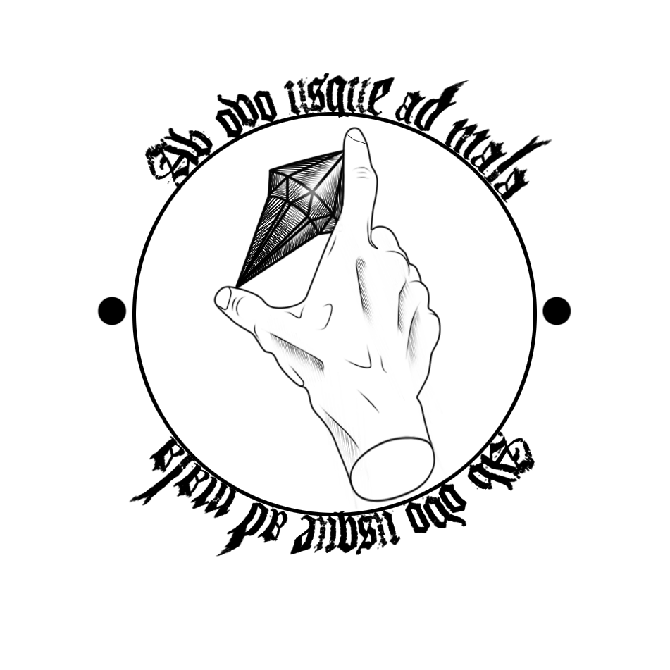
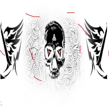
c/ped head "black flag"
Tell me what needs to be corrected n wheres my mistakes, thank you
Last edited by D3571NY; Feb 20, 2018 at 03:37 PM.
first thing i notice is the discrepancies and strong contrast in between the outline illustration and the font... outline art is generally fairly light and clean to look at, adding such a complex, thick grungy font (also slightly blurry), kinda kills it...
I understand your idea of using a Gothic looking font since you use a Latin say (from the egg to the apples) but you might be able to make it more sharp looking and slim it down.
I understand your idea of using a Gothic looking font since you use a Latin say (from the egg to the apples) but you might be able to make it more sharp looking and slim it down.
(\(e A e)/)
join The Pixel support group
join The Pixel support group
The logo thingy looks good. If you draw it the is improvement to be had.
The head is just plain crap. Design, mapping and resolution wise...
The head is just plain crap. Design, mapping and resolution wise...
= SELLING MARKET INVENTORY =
Pm me for deals
Pm me for deals