oyster, very nice, its my style and can see it implemented into other systems better than skura's sofar, but i dont see how the design on the left has any relevance to GATA... unless you'd like to explain further.
@skura, read my post on the previous post, just did a rough sketchup of my idea, but the straight lines just dont seem to work without the text... can you just give me a version of just the G and the head?
@luke, il get to work on one aswell
@doxxy, try working it into a more horizontal/landscape profile, search up some logo's on the net for a bit of inspiration
@everyone.
ghiita brought up a valid point with pointing out that he's willing to crit BECAUSE HE'S NOT COMPETING.
remember, this logo represents YOU, so critting the other competitors is in your best interests.
prize is just incentive
Last edited by BenDover; Jun 6, 2010 at 01:06 AM.
-=Art is never finished, only abandoned=-
hmmm
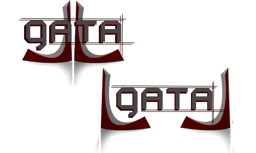
if you could split the two L shapes and place one on either side of the text, incorporate a colour(important)
sorta flanking the text, supporting it. or keep them together, but move them centrally, so the text is over the shapes
then you could link it to how GATA is the active pillar of strength to the toribash art community.
the shapes would take some editing to get them to be able to stand on their own
colour is necesary tho
-=Art is never finished, only abandoned=-
oyster you're logo is the closest to my likings
i think it could go nice with some gloss or shine.
i think it could go nice with some gloss or shine.