

Original Post


[Art] Artwork I've done for assignments or while I'm bored
Just a heads up, most of the work I've done I've never got round to finishing or I've just forgotten about them / Lost them.
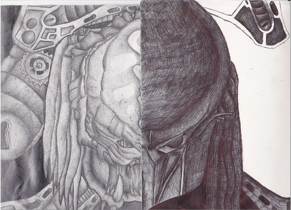
Predator Pen being predator with his helmet and pencil being predator without
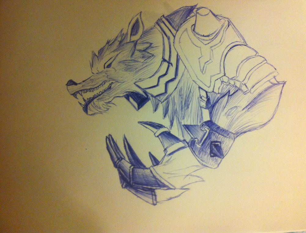
Not yet finished - Warwick
digital stuff

Last edited by RedPanda; Jan 24, 2016 at 08:51 PM.
Life's not a waste of time and time's not a waste of life so let's stop wasting time, get wasted and have the time of our lives - Mr Worldwide 3:18
I can see you're not lazy with your shading, and have a decent grasp of what you're doing.
Here's whats next:
*Draw a lot from references and make it look as close to it as possible. (Warwick for example, don't use just the actual champion, get a wolf reference, a wolfs skeleton structure, fur.. ect.) Do that and your images will really come to life.
*Take a spoon, a bottle, and a wood block. Paint them. Profit. You need to widen your range of value.
finna bump my thread with some stuff ive been working on/ using as practice to get the hang of using a drawing tablet.
ill just edit this post with updated pics as i go along
hit me up with that cnc fam.
also if any of yall know how to do delicate shading (like using a 6B pencil on paper) hit me up cause all attempts so far have ended poorly
wipip
ill just edit this post with updated pics as i go along
hit me up with that cnc fam.
also if any of yall know how to do delicate shading (like using a 6B pencil on paper) hit me up cause all attempts so far have ended poorly
Last edited by RedPanda; Jan 24, 2016 at 08:52 PM.
Life's not a waste of time and time's not a waste of life so let's stop wasting time, get wasted and have the time of our lives - Mr Worldwide 3:18
Well shit, that's really good! If i am to channel my inner nitpicker, here's a few things: If you're going for anatomical accuracy, the skin on the dogs head shouldn't be perfectly level with the skull. Also, the skulls nose hole should be a bit further backwards.
Considering that you DIDN'T mirror this (... i think), though, level of (implied) symmetry is pretty damn impressive! Also i love the shading, mmm.
Also, regarding delicate shading, i'm not entirely sure what you mean...? 6B isn't exactly what i'd call delicate, but it is lighter than 9B, for sure. Do you happen to have an example? I don't want to bore you with entry-level tips (read: most of what i know) that you're already familiar with, but i also don't want to pretend to know something that i don't. :v
<Blam|Homework> oiubt veubg
various places to find me lol
various places to find me lol
Originally Posted by Shook

Well shit, that's really good! If i am to channel my inner nitpicker, here's a few things: If you're going for anatomical accuracy, the skin on the dogs head shouldn't be perfectly level with the skull. Also, the skulls nose hole should be a bit further backwards.
Considering that you DIDN'T mirror this (... i think), though, level of (implied) symmetry is pretty damn impressive! Also i love the shading, mmm.
Also, regarding delicate shading, i'm not entirely sure what you mean...? 6B isn't exactly what i'd call delicate, but it is lighter than 9B, for sure. Do you happen to have an example? I don't want to bore you with entry-level tips (read: most of what i know) that you're already familiar with, but i also don't want to pretend to know something that i don't. :v
Thanks, and yeah i understand what you mean, i forgot to make the skin slightly more elevated than the skull. the nose is a bit too high so i might move it down a little later and make the canvas longer. ill get to work on these fixes tomorrow.
also dont worry about entry level tips, so far im new to digital art so entry level tips on more realistic shading and some lineart (still having to get used to this style) would be very helpful.
so far my attempts either look too smudged or just dont look nice at all.
about the pencil shading thing i mean something similar to this

having opacity on the pressure sensitivity seems to not work as much like a pencil as id hoped.
Life's not a waste of time and time's not a waste of life so let's stop wasting time, get wasted and have the time of our lives - Mr Worldwide 3:18
