Original Post


[TEX] Sand/Rock God texture
I feel like im improving on my art so gonna try and do an realisticisch head/ set here. I will return CnC when I get some,
Programm used gimp2.0
Made it after Oondasta's stone mask
-----
And yeah messed up again... could mod change tag to tex would be awesome thx
-----
Decided to change to the style of the head with help of Kdignitydog.
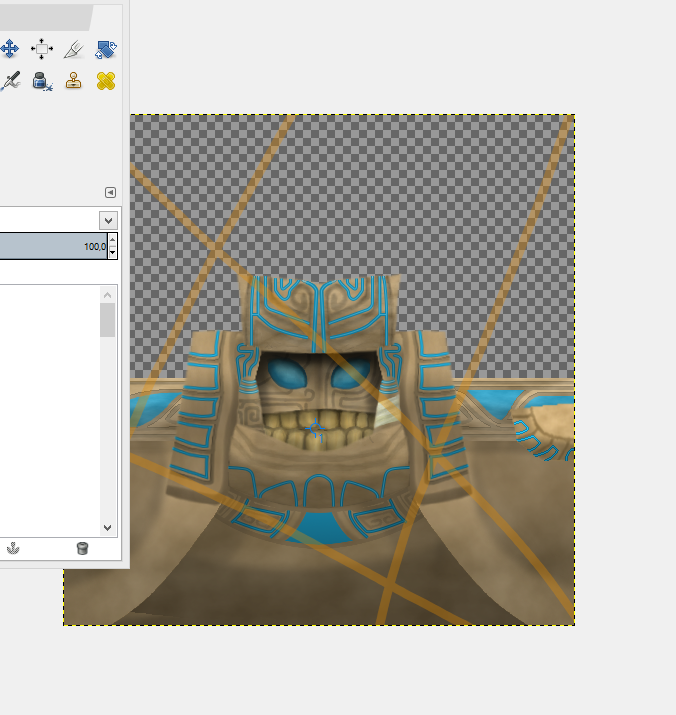
Last change to give CNC
Programm used gimp2.0
Made it after Oondasta's stone mask
Refrence (kinda)

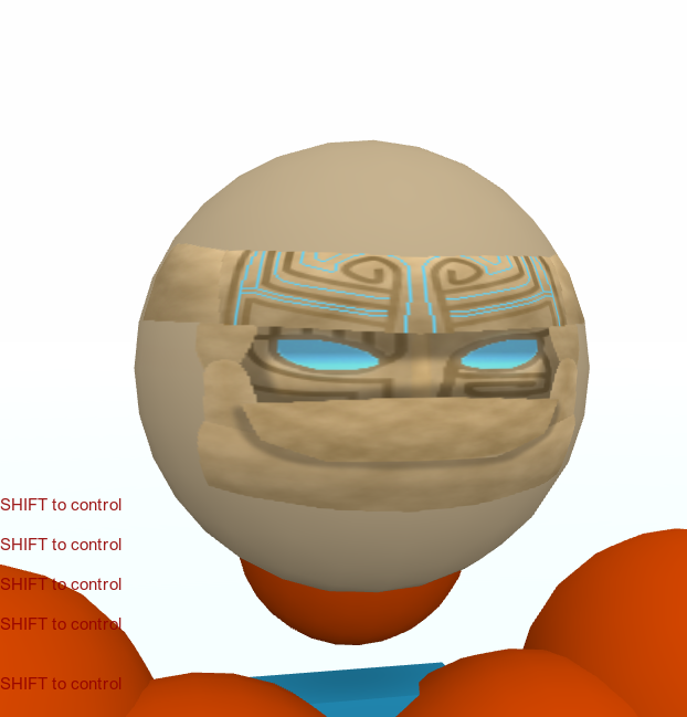
#1 Wip
-----
And yeah messed up again... could mod change tag to tex would be awesome thx
-----
#2 Wip

#3 Wip
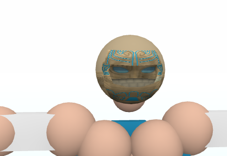
#3.5 Wip (Minor changes)

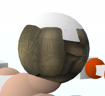
#Wip 4
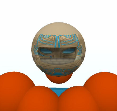
Decided to change to the style of the head with help of Kdignitydog.
#Wip 5 (so many wips)

#6 Wip


#7 Wip

Last change to give CNC
Tada


Last edited by Headles; Oct 12, 2015 at 03:54 PM.


Senior Member