

Original Post


[TEX] something I made for some event
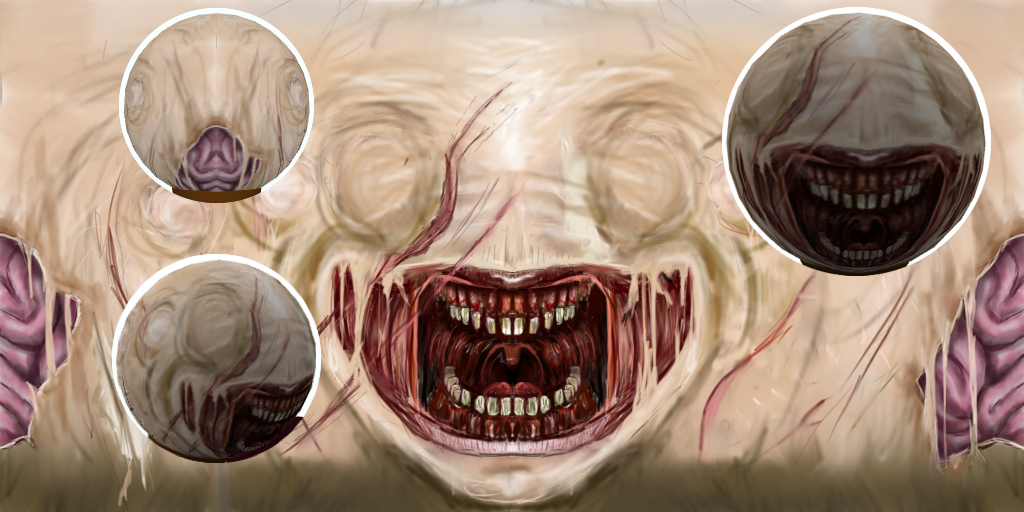
here's my submission for the III monthly art contest, its III, right?
well
anyways
tell me how to make et better
this is wip 2:
well
anyways
tell me how to make et better
this is wip 2:

Last edited by Veoo; Apr 3, 2016 at 07:16 PM.
it is good, you have a good notion of face features an mapping.
I only can say about the dirty of it, some parts doesnt look shaded, just look stroked.
looks like you are developping a style, keep doing art.
I only can say about the dirty of it, some parts doesnt look shaded, just look stroked.
looks like you are developping a style, keep doing art.
Jesus Christ. I was not expecting to see something like this when I opened this thread. It's very good. And very scary.
Your attention to detail is pretty damn good. i can't even do that. Looks fantastic.
The left scratch closest to the center, going down the face still has the slit when passing the mouth. I think it'd look better if it would disappear during that part.
Your attention to detail is pretty damn good. i can't even do that. Looks fantastic.
The left scratch closest to the center, going down the face still has the slit when passing the mouth. I think it'd look better if it would disappear during that part.

"Dear reader, I hope this email finds you before I do."
Originally Posted by dengue

it is good, you have a good notion of face features an mapping.
I only can say about the dirty of it, some parts doesnt look shaded, just look stroked.
looks like you are developping a style, keep doing art.
Ye. I agree. The reason that is, is because Im trying to get away from smudging shit and making the whole thing blurry. but Ill try to find a compromise.
Originally Posted by WeooWeoo
Jesus Christ. I was not expecting to see something like this when I opened this thread. It's very good. And very scary.
Your attention to detail is pretty damn good. i can't even do that. Looks fantastic.
The left scratch closest to the center, going down the face still has the slit when passing the mouth. I think it'd look better if it would disappear during that part.
Thanks man. I can see what you mean about the slit thingy. Ill get on that for the next wip!