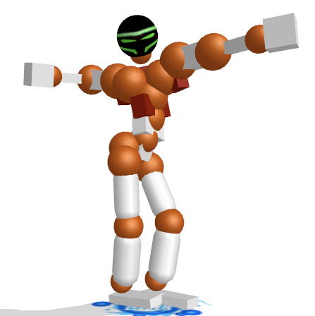
first version is ok, but design wise, pretty standard
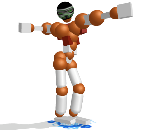
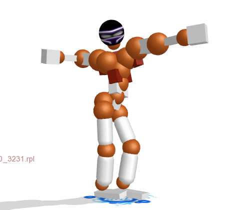
later versions look too effectish
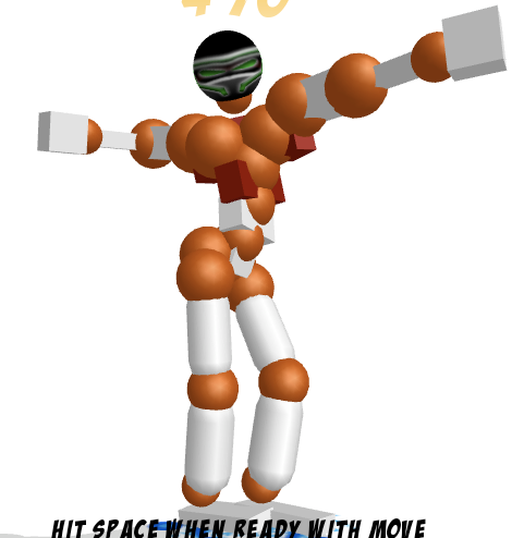
the 3rd one without the funny glow would be quite nice, with a similar type design at the back
later versions look too effectish
the 3rd one without the funny glow would be quite nice, with a similar type design at the back
-=Art is never finished, only abandoned=-
don't really like the colour, or the blurry lines. Head seems very empty, a few lines dumped on a black background.
Try to work the deisgn and seperate the areas of the head.
Also you should crop the images down, we only want to see the head :P
Try to work the deisgn and seperate the areas of the head.
Also you should crop the images down, we only want to see the head :P
When I see you, my heart goes DOKI⑨DOKI
Fish: "Gorman has been chosen for admin. After a lengthy discussion we've all decided that Gorman is the best choice for the next admin."


