

Original Post


[WIP] *Insert Cool Name Here* Head Texture
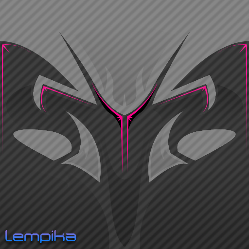
Thanks to AlphasoniK teaching me tricks and tips on PhotoShop CS4, and the continuous help from him, I've created a new tribal head texture. C&C please.


I'm being told by Oyster that I should add eyes, but I can't seem to make it work with the rest of the design. Any ideas?


I'm being told by Oyster that I should add eyes, but I can't seem to make it work with the rest of the design. Any ideas?
i think the design is zawsome
these accentrs with the spikes are starting to grate me tho...
think simple eyes. either a darker grey or white under the pink accents would be nice
sorta like this. flowing in from the bottom, flowing out at the top.
very rough, but you get the point. adding a pupil to teh eye is an option, unless you want to keep away from it being too figurative
-=Art is never finished, only abandoned=-
To be honest, I see the middle pink accents as eyes.
Looks perfect to me O:
Looks perfect to me O:
Fr3styL . Improving by Improvising
I'm an artist.
I'm an artist.
Or just add another pair of pink lines under your current ones? Cuz right now, for eyes, the high pink lines are a bit too high and maybe a bit too narrow, personally speaking.
Call it....Fladnag. Gandalf backwards!
Call it....Fladnag. Gandalf backwards!


