Original Post


[Art]Some new art stuff
Thought I could start posting my art here to bring some life to GATA 
Too blurry and you need to work on backgrounds - even getting something simple there instead of a blurry forest/tunnel or blurry metal thing. I do like the background on the last one though.
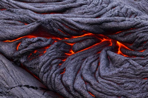
If you hardened up your style you may end up like this
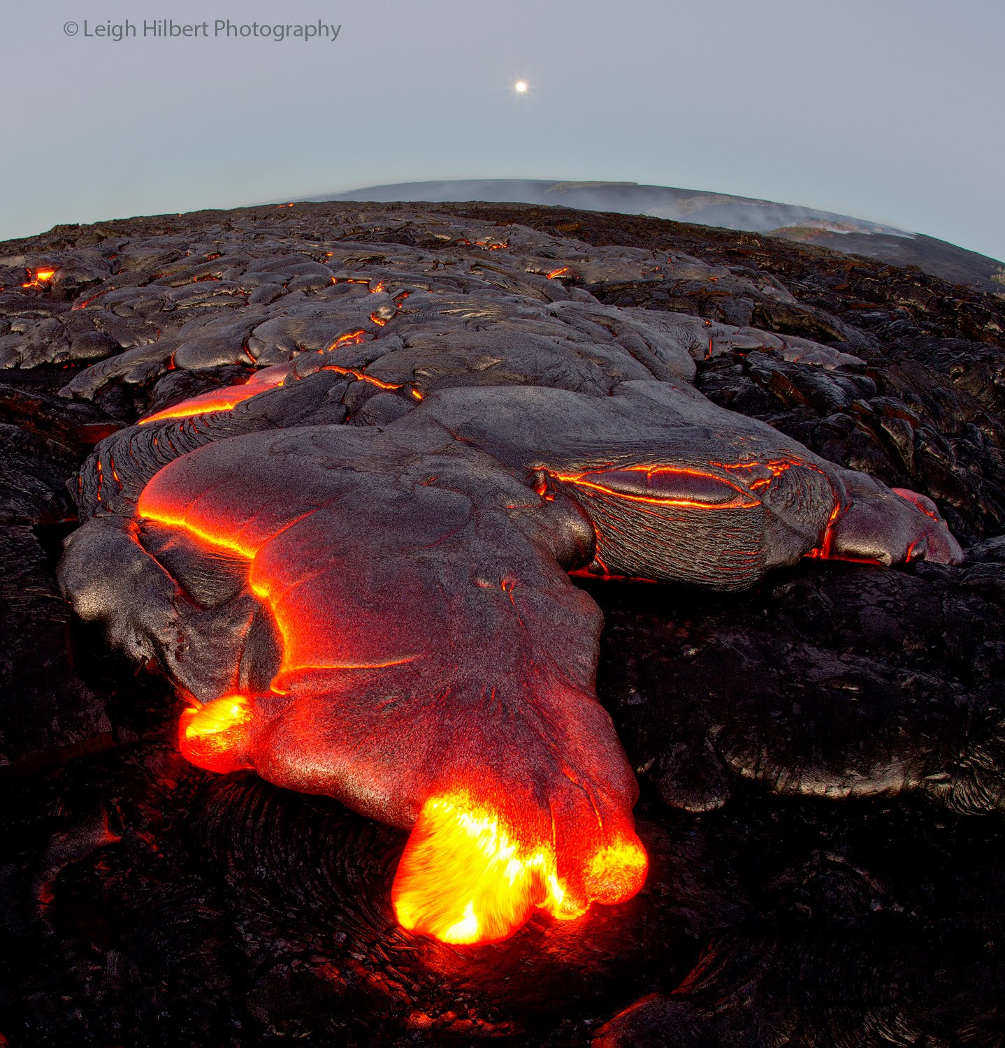
Your last pic looks kind of like pastel due to the texture, pretty nice work man. I think you should do some anatomy study
If you hardened up your style you may end up like this
Your last pic looks kind of like pastel due to the texture, pretty nice work man. I think you should do some anatomy study
i agree with most of gormans points
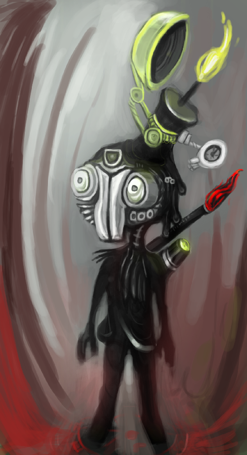
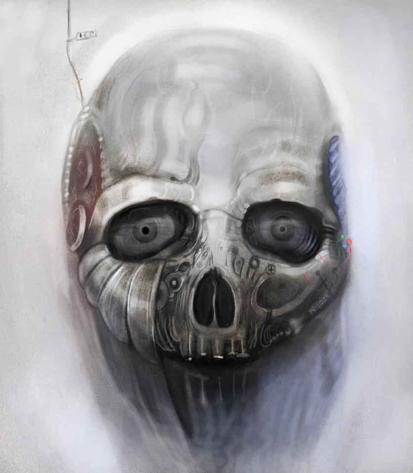
the robot anatomy ones anatomy could be improved and more defined, solidifying your work would make it more awesome
red bits reshaped
blue bits need more depth/definition
you did a fantastic job around the eyes, and did a great job making it look smooth and metalic, but lost it a bit elsewhere
generally needs more depth, good job on the dark side of the face, but the rest of the head looks flat
the anatomical correction is just me being pedantic.
Last edited by BenDover; Dec 31, 2012 at 12:08 PM.
-=Art is never finished, only abandoned=-
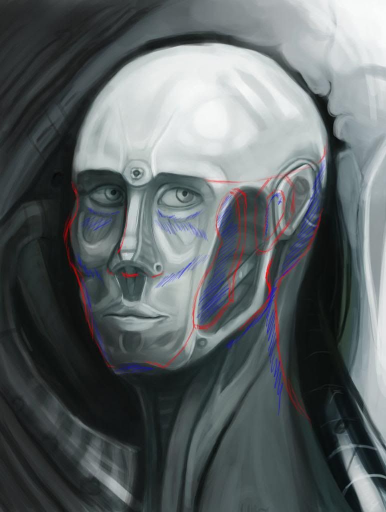
Have to agree again as above refining your shapes and creating a sharper image will bring these out very nicely.
One thing i'd recommend is to use a few more tones throughout your toning process, the change from grey to white or from grey to charcoal is quite direct is some of images even if your going for that impressionistic feel the change is still a little too stark. Your 3rd image seems incorporate this more than the others and looks alot more realistic due to.
Your backgrounds need touched on, shapes and tones are good enough but in order to create an accurate image of depth you'll need some persepctive points to at least put some scale to the image.
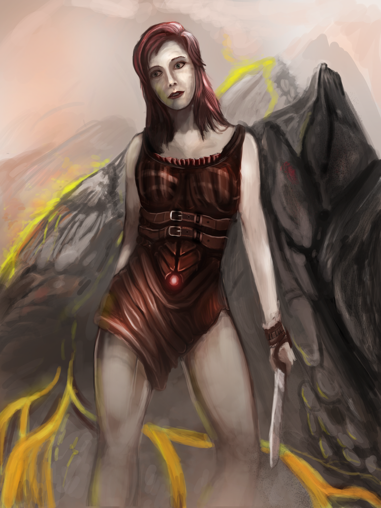
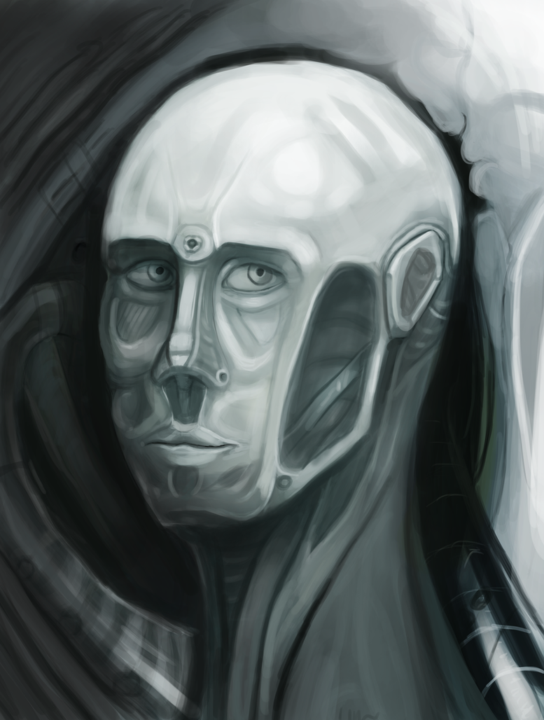
Tried to keep everythig you guys said in mind when making this one, more depth and have a bigger color range and interesting background. I could still make it sharper though. Elbow situation is a bit wierd, maybe one of you anatomy experts can lecture me xD