Looking good Gabiel.
What did you use to shade it?
Sorry for off topicness.
Please PM me.
What did you use to shade it?
Sorry for off topicness.
Please PM me.
Fr3styL . Improving by Improvising
I'm an artist.
I'm an artist.

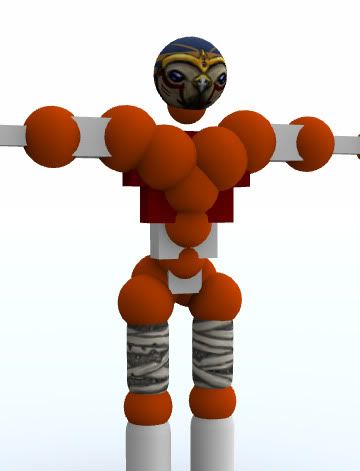
just one wip for know if the style & the color are good , or not
http://forum.toribash.com/showthread.php?t=129215
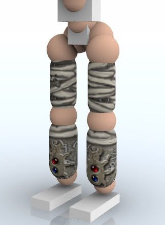
Vermine, I like the colors. The legs are nice - I hope they aren't flipped as I can't see the back to verify. The arms seem a bit too messy for me, I understand the picture can't be mapped onto Tori so this could stand difficult. The head is the part I'm having trouble liking, first my name is Eckz  , and if you wanted to include my name anywhere:
Eckz = X
I would prefer that it not be a human. I enjoy Ra out of all the gods.
On the Deviant Art images that I supplied I like the cloth pants, the gauntlets, the hands can be skin-like, the pauldron..
I guess it depends on which god you would most be comfortable making, vermine, so let me know and I can make a more direct list for you.
X
, and if you wanted to include my name anywhere:Eckz = X
I would prefer that it not be a human. I enjoy Ra out of all the gods.
On the Deviant Art images that I supplied I like the cloth pants, the gauntlets, the hands can be skin-like, the pauldron..
I guess it depends on which god you would most be comfortable making, vermine, so let me know and I can make a more direct list for you.
X
Last edited by Eckz; Oct 14, 2009 at 01:30 AM.
idle

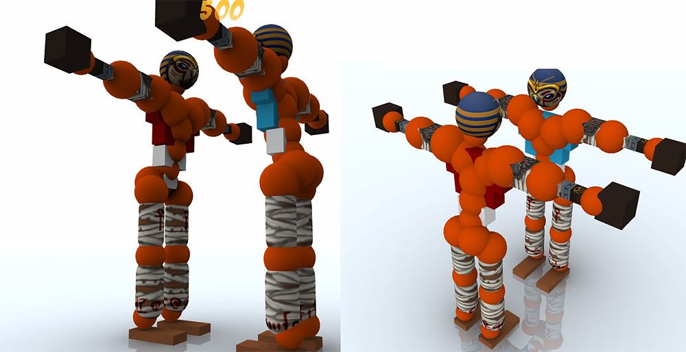
Shot at 2009-10-15

Shot at 2009-10-15

Shot at 2009-10-15
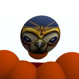
actually look like that , hands are bad here so dont look at it .
here a black cat like bastet i think . horus is hard it always look like a duck with me .
sekmeth is possible i have one in progress . anubis is hard too .
so , more soon ^^