Original Post
[TEX] Jebus and Veoo Collab.
I don't think anyone will but just a reminder: please don't steal (prolly get reported)
Program for me is Photoshop, I'm not quite sure what jebus is using
DETAILING:
Program for me is Photoshop, I'm not quite sure what jebus is using
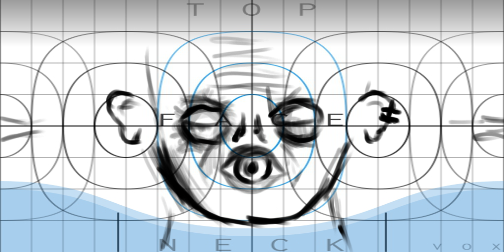
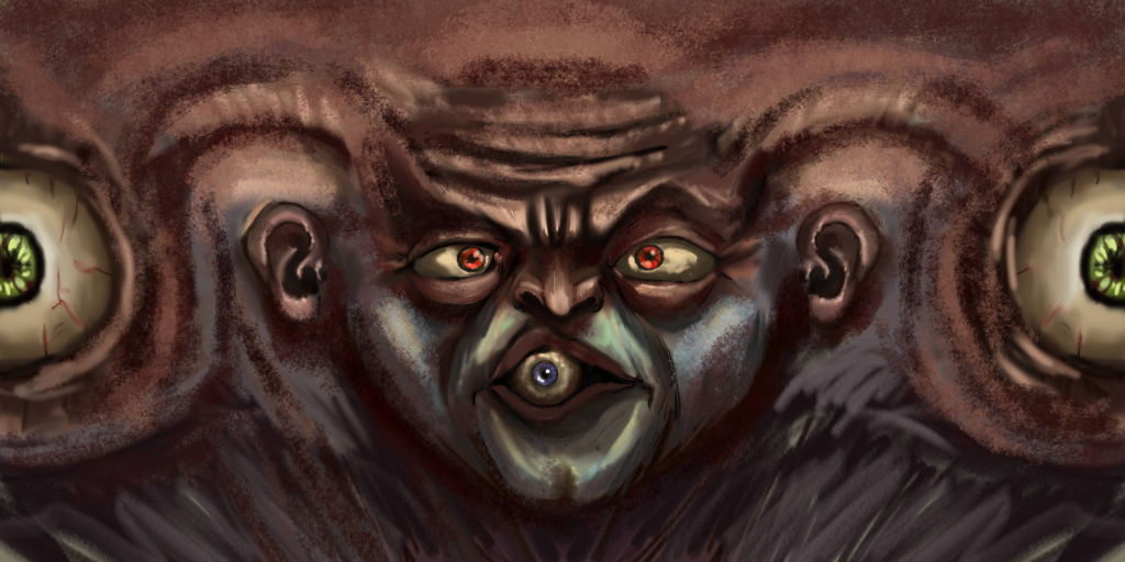
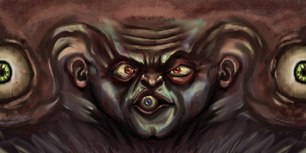
WIP 1 (me)
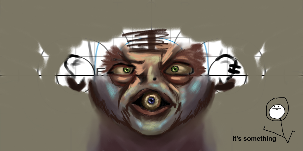
WIP 2 (Jebus)
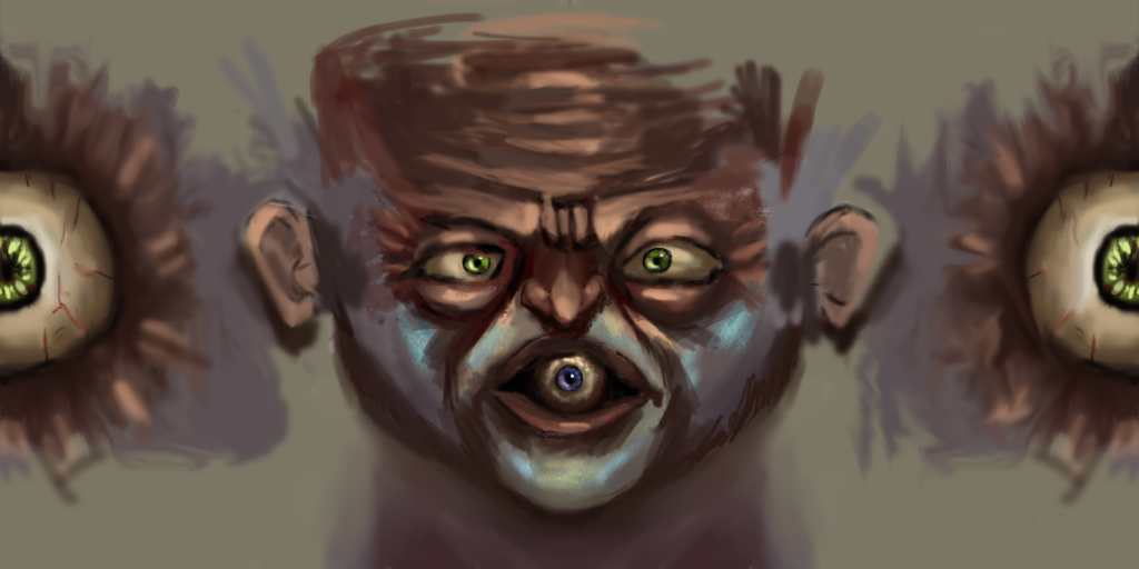
WIP 3 (me)
WIP 4 (Jebus)
WIp 5 (me)
WIP 6 (Jebus)
DETAILING:
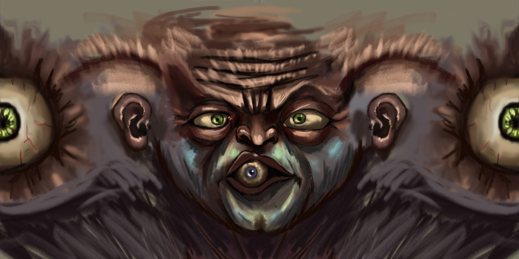
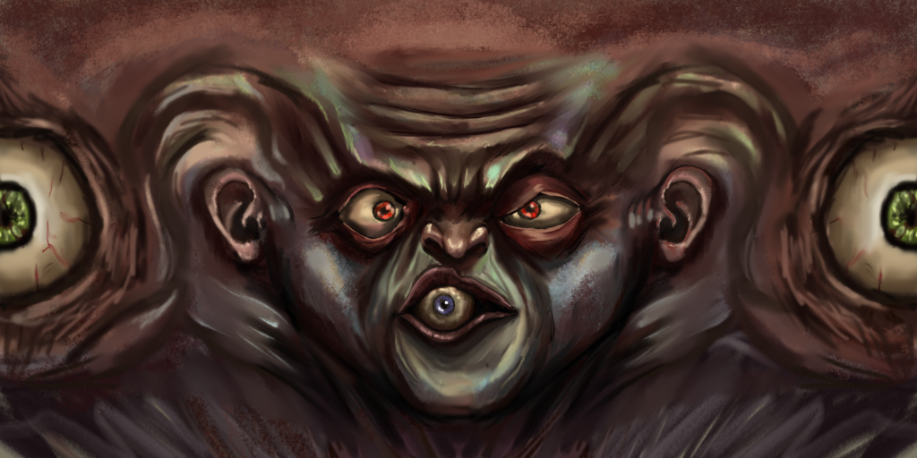
WIP 7 (me)
Last edited by Veoo; Oct 1, 2016 at 02:15 AM.
It's going to be an epic piece!
Can't wait for the next Wip
The last wip has a lot of personality from the nouse and the mouth. Maybe the chin looks a bit odd but it's artists view so no comment
Can't wait for the next Wip
The last wip has a lot of personality from the nouse and the mouth. Maybe the chin looks a bit odd but it's artists view so no comment
= SELLING MARKET INVENTORY =
Pm me for deals
Pm me for deals
Damn son this looks nice as fuck.
Insanity, I see what you mean. The chin doesn't look mirrored, which is good. But right above it, the color around the top portion of the mouth looks mirrored in color. I know it isn't, but it looks more symmetrical
Insanity, I see what you mean. The chin doesn't look mirrored, which is good. But right above it, the color around the top portion of the mouth looks mirrored in color. I know it isn't, but it looks more symmetrical

"Dear reader, I hope this email finds you before I do."
It's going to be an epic piece!
Can't wait for the next Wip
The last wip has a lot of personality from the nouse and the mouth. Maybe the chin looks a bit odd but it's artists view so no comment
Thanks so much insanity. We'll Work on the chin.
Damn son this looks nice as fuck.
Insanity, I see what you mean. The chin doesn't look mirrored, which is good. But right above it, the color around the top portion of the mouth looks mirrored in color. I know it isn't, but it looks more symmetrical
Thanks weoo

We'll fix the chin like I said. The ton portion of the mouth?
Im gonna work on the mouth idek what you mean by mirror but it will change


