Original Post

Appeal to the web design team: make the forum interface not fucking stupid
hi toribash staff. this is an issue that has bothered me for a long time. any post with less than 2 full paragraphs leaves a huge amount of empty space for literally no reason. even with signatures and avatars off, i can only see about 3 to 4 posts on the page at once.
why?
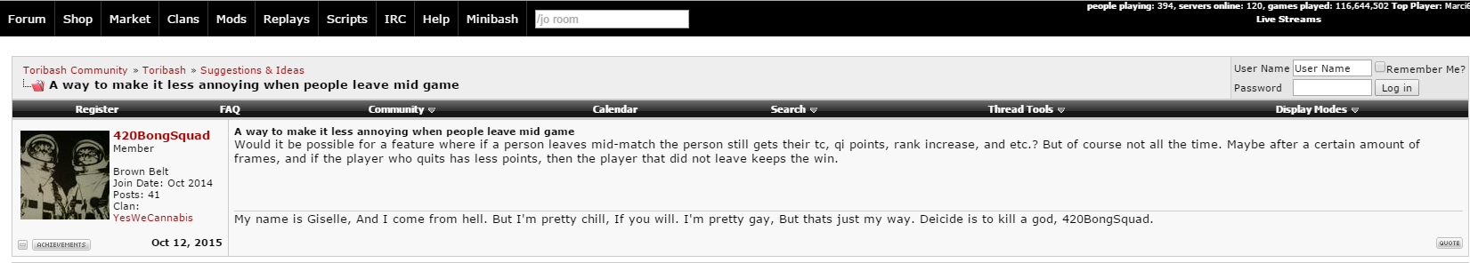
this next image was all I could fit into 1 visible space and none of the posts had even extended the box at all. this is the MINIMUM SIZE for posts.
here. for reference, lets see the post size of some other popular bulletin boards and social media.
Reddit:

here you can see multiple posts.

wait a sec. those reddit posts are pretty dang small! let's see how many we can fit in one Toribash post.
three posts! goodness gracious
>>but boStaff, Reddit isn't a bulletin board! toribash doesn't have nested replies; that's an unfair comparison!
that's a fair point. why don't we look at a more traditional bulletin board without any sort of default nesting.
4chan:


Bear with me; I know 4chan isn't a shining example of a functioning community, but its design is brilliant and fundamentally compact. look at those teeny tiny posts! wowie zowie!!
>>B-b-but boStaff, 4chan doesn't have avatars and signatures!! That must be the reason posts on Toribash are so bloated, right??
well, first off, all the toribash examples I've posted are with avatars and signatures disabled. how interesting
but you're right -- the posts are EVEN FUCKING BIGGER with avatars and signatures enabled.
Wow, glad i had all that blank space for that 2-sentence shitpost. how practical! wait no
Here's what it would look like if the post was resized proportional to the amount of content.
you could probably optimize space even further, but you get the point.
lets see how many we can fit in the original, unaltered post!
that's almost 2!
now how many can fit in a full page?
wow. instead of the 3 original posts that I showed in that section of my screen, it totals to about 5.2. my monitor is pretty low-res too (1280x1024). keep in mind that the original picture had NO avatars and NO signatures, yet the edited version has both.
This is also keeping all the user information intact, too. belt rank, join date, report button, whatever. if users didnt feel the need to be special snowflakes then we could make the posts even smaller, but I can only argue so much.
I understand that this specific method would be awkward with larger avatars. maybe you could have the avatar on one side of the post and the information on the other or something. i'm not a web or graphic designer. these ideas aren't perfect. that's why YOU are the staff and I'm not. but that does not discount my suggestion; it is in no objective way a negative change and can only help the quality of the board. as far as I'm aware, it should be easy to do, too. my suggestion isn't a complete overhaul of the interface, it's just a minor change in the usage of screen space.
get on this please, devs. i guarantee none of you want to have an inefficient or impractical looking board. bostaff out

why?
this next image was all I could fit into 1 visible space and none of the posts had even extended the box at all. this is the MINIMUM SIZE for posts.
what the fuck

here. for reference, lets see the post size of some other popular bulletin boards and social media.
Reddit:
here you can see multiple posts.
wait a sec. those reddit posts are pretty dang small! let's see how many we can fit in one Toribash post.
gif

three posts! goodness gracious
>>but boStaff, Reddit isn't a bulletin board! toribash doesn't have nested replies; that's an unfair comparison!
that's a fair point. why don't we look at a more traditional bulletin board without any sort of default nesting.
4chan:
Bear with me; I know 4chan isn't a shining example of a functioning community, but its design is brilliant and fundamentally compact. look at those teeny tiny posts! wowie zowie!!
>>B-b-but boStaff, 4chan doesn't have avatars and signatures!! That must be the reason posts on Toribash are so bloated, right??
well, first off, all the toribash examples I've posted are with avatars and signatures disabled. how interesting
but you're right -- the posts are EVEN FUCKING BIGGER with avatars and signatures enabled.
i wonder why the toribash posts are the only ones i have to spoil....hmmmmmmmmmmm.......

Wow, glad i had all that blank space for that 2-sentence shitpost. how practical! wait no
Here's what it would look like if the post was resized proportional to the amount of content.

you could probably optimize space even further, but you get the point.
lets see how many we can fit in the original, unaltered post!

that's almost 2!
now how many can fit in a full page?
kinda big

wow. instead of the 3 original posts that I showed in that section of my screen, it totals to about 5.2. my monitor is pretty low-res too (1280x1024). keep in mind that the original picture had NO avatars and NO signatures, yet the edited version has both.
This is also keeping all the user information intact, too. belt rank, join date, report button, whatever. if users didnt feel the need to be special snowflakes then we could make the posts even smaller, but I can only argue so much.
I understand that this specific method would be awkward with larger avatars. maybe you could have the avatar on one side of the post and the information on the other or something. i'm not a web or graphic designer. these ideas aren't perfect. that's why YOU are the staff and I'm not. but that does not discount my suggestion; it is in no objective way a negative change and can only help the quality of the board. as far as I'm aware, it should be easy to do, too. my suggestion isn't a complete overhaul of the interface, it's just a minor change in the usage of screen space.
get on this please, devs. i guarantee none of you want to have an inefficient or impractical looking board. bostaff out
Last edited by boStaff; Nov 16, 2015 at 06:57 AM.
shmevin eats smegma

well it's not like half the posters in this thread support the idea or anything...
also sir, did you read the OP? i clearly designed a more compact post theme that detracts LITERALLY NOTHING from the post.
also Tuna if you didnt have cataracts in your eyes you'd see my point about appealing to tradition still stands; im not saying we should change SOLELY because Reddit does something (and already has been), i'm pointing out the fact that much more popular communities adhere to a trend of better themes for their posts. hmm, i wonder if there is any correlation
I also have avatars and signatures disabled. post backgrounds dont bother me because they dont do much to bloat a post like the others do. but disabling avatars is mostly useless - even without them, posts actually don't get any smaller. i can provide examples if you dont believe me
Last edited by boStaff; Nov 21, 2015 at 12:18 AM.
shmevin eats smegma
Getting back to this. Does this look better? http://code.toribash.com/~sir/showth...226&styleid=20
Still has an issue with stretching tables on long names but making profile part wider looks crappy.
Also I killed the whitespace in forum's default style (you can see that on my post now).
Still has an issue with stretching tables on long names but making profile part wider looks crappy.
Also I killed the whitespace in forum's default style (you can see that on my post now).
Only supporting if this is an option and non-default style.
Really it just looks cluttered, I know this is an early WIP but I prefer what we have now immensely.
Really it just looks cluttered, I know this is an early WIP but I prefer what we have now immensely.

Originally Posted by sir

Getting back to this. Does this look better? http://code.toribash.com/~sir/showth...226&styleid=20
Still has an issue with stretching tables on long names but making profile part wider looks crappy.
Also I killed the whitespace in forum's default style (you can see that on my post now).
looks great! i would consider making the black bars smaller since they now take up about 5-10% of the post. also consider putting avatars on the right side of the post; may seem weird but I've seen it work well on lots of forums. you also could just make the name smaller and a bit bolder.
my apologies to the staff for the harsh language, by the way. i'm trying to help the community because i love the community. you guys are my home.
Last edited by boStaff; Nov 24, 2015 at 10:17 AM.
shmevin eats smegma