keeping in mind that it is a perfectly fine head. The face idea is pretty cool too. But whatever, this is the stuff I might think about if i was being picky.

orange: my preference is to have straight lines on the sphere. At least if they run parallel for a while.
blue: squish the face in a bit. when viewed from straight on it gives a fat impression because everything is going ((( ))) the 1/4 view looks pretty cool though.
teal: there is a large area on the side where it is just straight metal. this could be used to connect the chin area and build in some shapes with the green area, or pop the face out a bit more.
magenta: idk what this is but... hmmm yea. its round, and your face is square.
yellow: some perspective weirdness, looks almost like its making the metal bend unnaturally.
green: Personally i would consider redoing this whole part just because it doesn't really fit with the rest of the head, it isn't giving me any sort of bulky machine feelings like the face and back.
Scratches, dents, dings, wear and tear: Personally I think they are overkill and too many people request things that they want "damaged." However they can add some charm if done right. and yours looks like someone took a grinder and cut little slices EVERYWHERE. Really you would have a higher chance of having dents in the corners of your metal where the metal would deform and reflect the light differently, rather than actually break, as you are simulating in some areas. (i can't explain this how i want to ) here's a picture. kinda
But overall, i would probably wear it. At least for a little while.
orange: my preference is to have straight lines on the sphere. At least if they run parallel for a while.
blue: squish the face in a bit. when viewed from straight on it gives a fat impression because everything is going ((( ))) the 1/4 view looks pretty cool though.
teal: there is a large area on the side where it is just straight metal. this could be used to connect the chin area and build in some shapes with the green area, or pop the face out a bit more.
magenta: idk what this is but... hmmm yea. its round, and your face is square.
yellow: some perspective weirdness, looks almost like its making the metal bend unnaturally.
green: Personally i would consider redoing this whole part just because it doesn't really fit with the rest of the head, it isn't giving me any sort of bulky machine feelings like the face and back.
Scratches, dents, dings, wear and tear: Personally I think they are overkill and too many people request things that they want "damaged." However they can add some charm if done right. and yours looks like someone took a grinder and cut little slices EVERYWHERE. Really you would have a higher chance of having dents in the corners of your metal where the metal would deform and reflect the light differently, rather than actually break, as you are simulating in some areas. (i can't explain this how i want to
) here's a picture. kindaBut overall, i would probably wear it. At least for a little while.
i disagree with chillz orange point, i think lines like that end up in the typical V shape too often.
i do agree with him on the pink circles and his perspective points.
perspective and angles are dangerous.
also agree that the head is perfectly fine.
the growth since your earlier werks is really significant.
really good job
i do agree with him on the pink circles and his perspective points.
perspective and angles are dangerous.
also agree that the head is perfectly fine.
the growth since your earlier werks is really significant.
really good job
-=Art is never finished, only abandoned=-
Lots of HP
Originally Posted by 13chillz

keeping in mind that it is a perfectly fine head. The face idea is pretty cool too. But whatever, this is the stuff I might think about if i was being picky.
orange: my preference is to have straight lines on the sphere. At least if they run parallel for a while.
blue: squish the face in a bit. when viewed from straight on it gives a fat impression because everything is going ((( ))) the 1/4 view looks pretty cool though.
teal: there is a large area on the side where it is just straight metal. this could be used to connect the chin area and build in some shapes with the green area, or pop the face out a bit more.
magenta: idk what this is but... hmmm yea. its round, and your face is square.
yellow: some perspective weirdness, looks almost like its making the metal bend unnaturally.
green: Personally i would consider redoing this whole part just because it doesn't really fit with the rest of the head, it isn't giving me any sort of bulky machine feelings like the face and back.
Scratches, dents, dings, wear and tear: Personally I think they are overkill and too many people request things that they want "damaged." However they can add some charm if done right. and yours looks like someone took a grinder and cut little slices EVERYWHERE. Really you would have a higher chance of having dents in the corners of your metal where the metal would deform and reflect the light differently, rather than actually break, as you are simulating in some areas. (i can't explain this how i want to
But overall, i would probably wear it. At least for a little while.
Alright! Thank you for the CnC. I'll keep everything in mind, it sure will help me to improve in the future.
Originally Posted by BenDover
i disagree with chillz orange point, i think lines like that end up in the typical V shape too often.
i do agree with him on the pink circles and his perspective points.
perspective and angles are dangerous.
also agree that the head is perfectly fine.
the growth since your earlier werks is really significant.
really good job
I'm really glad to hear that, BenD. Thank you!
taking art requests for USD
Forumite

I made this for M.O.R. cnc please and thank you its my first head texture after about 2 months im trying to end my hiatus and start making heads again 
alien

I still take texture requests for usd


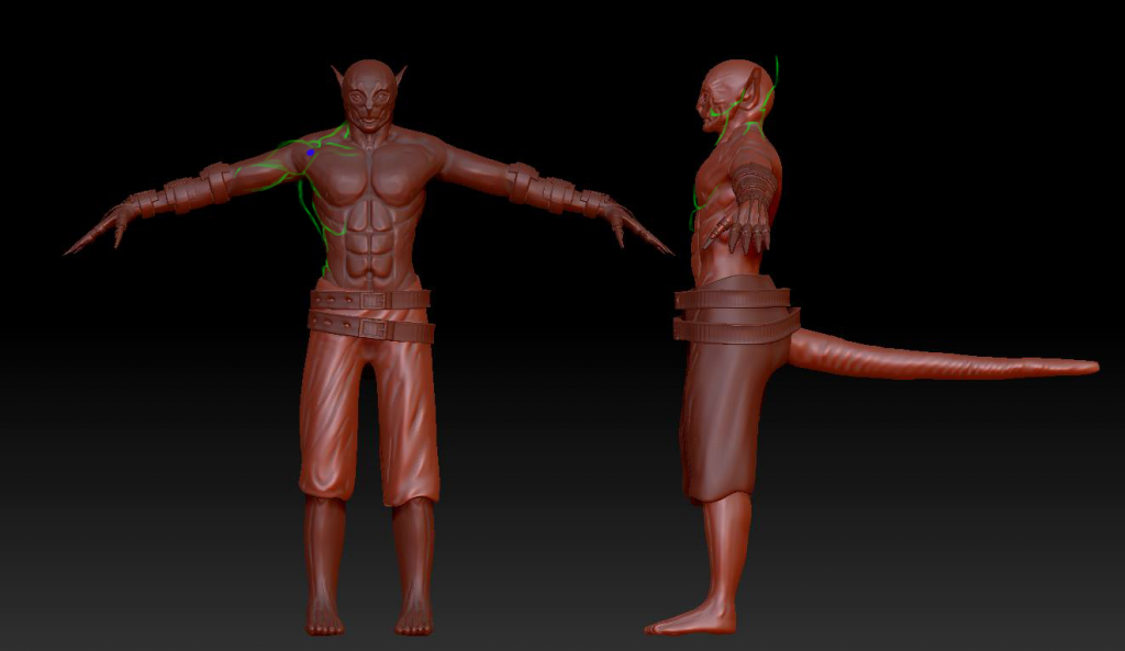
Using the same base model as my lizard character, but going a whole different way, going to make it sort of a dark-elfish character with sharp mechanical claw-like hands like this http://www.videogamesartwork.com/gam...i/fist-weapons this will also get rigged and posed, and I will do it properly this time, no rush

Last edited by Ezeth; Aug 19, 2014 at 04:07 AM.