


Hey weoo, was going to give you cnc earlier on but i'm on a holiday in Korea and stuff so i rarely get on my laptop.
*mb if words are a little confusing, i use a trackpad for everything
Anyway, let's go. First thing's first, do your research on Holden. He has no fringe and he has short hair that doesn't come close to touching the end of his neck. Side of the hat is extremely wrong, it is in no way sharp at the end, it's rectangular. You've made the top part of the hat look flat since there's no depth to emphasise the fact that it has that thing caps have.
His eyes make him look out of character and the fact that he's missing his cigarette is very damaging to his "image". There are obvious outlines to his cap and a little thing at the top of caps which you've missed out on. As for his expression, he looks flustered and/or shy which is misleading because in all the images i've seen him in, he looks depressed and grumpy. The mapping of the head is alright but you really need to create more accurate outlines. I would say that it's imperative for cartoony head textures - it's what makes the image pop. Just go through trial and error, you'll improve eventually.
-
Also, stop making hair look like icicles, add some waves
quickie
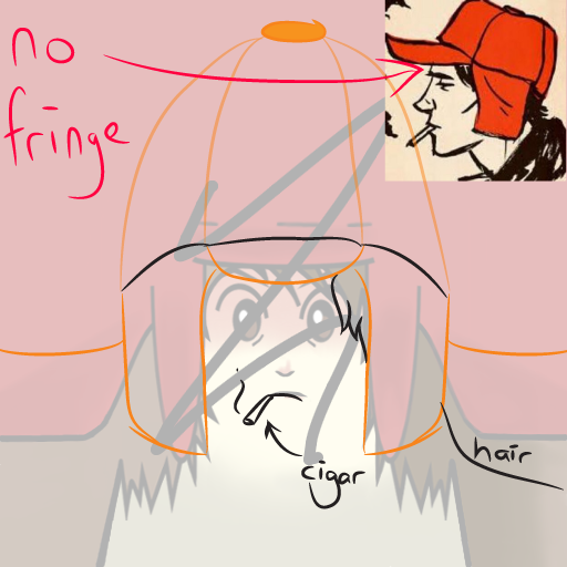
Anyway, let's go. First thing's first, do your research on Holden. He has no fringe and he has short hair that doesn't come close to touching the end of his neck. Side of the hat is extremely wrong, it is in no way sharp at the end, it's rectangular. You've made the top part of the hat look flat since there's no depth to emphasise the fact that it has that thing caps have.
His eyes make him look out of character and the fact that he's missing his cigarette is very damaging to his "image". There are obvious outlines to his cap and a little thing at the top of caps which you've missed out on. As for his expression, he looks flustered and/or shy which is misleading because in all the images i've seen him in, he looks depressed and grumpy. The mapping of the head is alright but you really need to create more accurate outlines. I would say that it's imperative for cartoony head textures - it's what makes the image pop. Just go through trial and error, you'll improve eventually.
-
Also, stop making hair look like icicles, add some waves
Last edited by iAwesome; Dec 26, 2015 at 12:27 PM.
Thank You, iAwesome.
I use a mouse, so it's difficult for me to do the curves better. The hair over all is bad since it was because of having mapping trouble. Even though I use the path tool here and there, it isn't that good. I know this isn't very similar to the actual Holden, I was trying things out. I'm just not that good without an actual sketch pad. .-.
I'd spend more time on these if I had the better hardware and software in doing so.
Last edited by WeooWeoo; Dec 27, 2015 at 10:35 AM.

"Dear reader, I hope this email finds you before I do."
i legit thought this was a girl with a boxing helmet on, i didn't even bother googling who is holden caulifield XD
Haha.
Yeah, I didn't try to go for exact detail with making this. Wasn't my intent on making it exactly like Holden. Which is why it isn't completley similar. I just did what I thought looked nice.
I still like what iAwesome added though. Helps a lot actually.
Yeah, I didn't try to go for exact detail with making this. Wasn't my intent on making it exactly like Holden. Which is why it isn't completley similar. I just did what I thought looked nice.
I still like what iAwesome added though. Helps a lot actually.
"Dear reader, I hope this email finds you before I do."