Ranking
as an art organization i imagine we can get more creative than just having “TAU” in big fancy letters and having them arranged in different ways

if theres going to be a logo i think it needs to look like we at least enjoyed making it and not forcing ourselves into typography
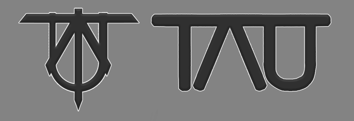
[SIGPIC][/SIGPIC]
tsu tsu cuckoo
I mean I personaly like typography logos.

I didnt really agree with dengues feedback, especially the helicopter one, LMAO


Refined them quickly I guess.


Chikin im not huge fan of how the T is almost a outcast of the other 2.

Not very knowledgeable in typography though.
Sup nerd
@headles: dont get me wrong. i like typography a lot. jazz album covers utilize it a lot.


perhaps make the letters different colors?

so at least people can distinguish what/where the T A and U are

gotta make it at least kinda legible
Last edited by Tsuion; Mar 29, 2018 at 11:39 PM.
[SIGPIC][/SIGPIC]
tsu tsu cuckoo
Originally Posted by Headles View Post
I mean I personaly like typography logos.

I didnt really agree with dengues feedback, especially the helicopter one, LMAO


Refined them quickly I guess.


Chikin im not huge fan of how the T is almost a outcast of the other 2.

Not very knowledgeable in typography though.

neat and cool, nice work.
I would stick with the heli one, lol.
Originally Posted by Fluxorious View Post
It's pretty obvious... No reason to make it fool-proof obvious. It's a symbol... it symbolizes


alright alright. just a suggestion is all


if you want to join tau you must idenify as an attack helicopter
[SIGPIC][/SIGPIC]
tsu tsu cuckoo
Lmfao, Ill leave it up for a bit,

If anyone wants to work more on it feel free to.
I atm like helicopter best.
Sup nerd
Originally Posted by Headles View Post
I mean I personaly like typography logos.

I didnt really agree with dengues feedback, especially the helicopter one, LMAO


Refined them quickly I guess.


Chikin im not huge fan of how the T is almost a outcast of the other 2.

Not very knowledgeable in typography though.

This is so fascist, structured, unoriginal, boring. Looks too aggressive and the one with the overlapping letters have a low readability.
also.. mine was done for the lols
Last edited by Chikin; Mar 30, 2018 at 02:06 AM.