

Original Post


smudge tool with a good scatter and opacity/flow jitter...
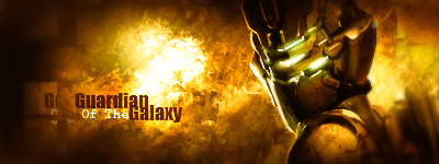
btw... i'm winning the sotw with deadspace one =D
btw... i'm winning the sotw with deadspace one =D
|[Essence]|GATA|Artist Co-Op|Italians Do It Better|TA|
|Pulse|HARWARE|bRuCiA|Weddark|Zalmoxis|
|Pulse|HARWARE|bRuCiA|Weddark|Zalmoxis|
Grunge effects do looks cool in sigs some times,but work with creating some fractal CS art work.
Expand your horizons a little bit.
4/10 on both of these sigs for lack of creativity.
Expand your horizons a little bit.
4/10 on both of these sigs for lack of creativity.
Inactive Due to RL Issues.
But I still love [l]. I also love you.
But I still love [l]. I also love you.
i've made them both for the same sotw...
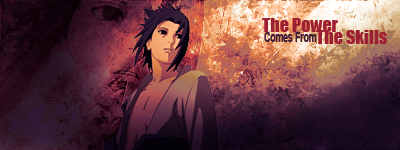
the first i've made was the sasuke one... but when i finished it, i read that the theme was videogames (FUUUUUUUU) and i made one with a deadspace render i used for a sign time ago... and i decided to use the same style =/ that's why they are similar =/
the first i've made was the sasuke one... but when i finished it, i read that the theme was videogames (FUUUUUUUU) and i made one with a deadspace render i used for a sign time ago... and i decided to use the same style =/ that's why they are similar =/
|[Essence]|GATA|Artist Co-Op|Italians Do It Better|TA|
|Pulse|HARWARE|bRuCiA|Weddark|Zalmoxis|
|Pulse|HARWARE|bRuCiA|Weddark|Zalmoxis|