

Original Post


[GFX] So like
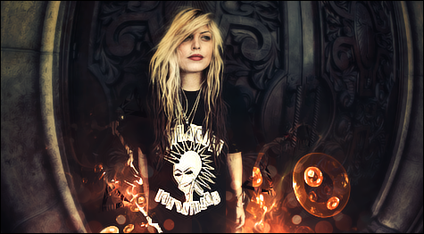
I know its pretty empty
I like doing art and stuff| GATA |... My Deviant Art Http://Riqochaii.Deviantart.com/
Wow I love the orange thing O.O
Really nice!!
I love that effect!
Really nice!!
I love that effect!
Raconteur
The sig somewhat lacks proper positioning of depth, like on the upper body, there is no depth effect, etc. It's seems like the girl was stuck on that background really badly.
Also is her right shoulder transparent? If so, why?
Otherwise, this sig is cool even if you concentrate on the minor flaws, but hey you can perfect it
Also is her right shoulder transparent? If so, why?
Otherwise, this sig is cool even if you concentrate on the minor flaws, but hey you can perfect it
<Marco> and then Oblivion tried to sexually assault me
<Oblivion> and Marco wasn't surprised at all
<Oblivion> and Marco wasn't surprised at all
I was trying something different so I blurred the upper body so that face on the shirt would stand out so the main focal was the shirt and the effects around the bottom
Also her black shirt is blending with the black shadow behind it
Also her black shirt is blending with the black shadow behind it
I like doing art and stuff| GATA |... My Deviant Art Http://Riqochaii.Deviantart.com/
I agree it's pretty empty,but who said all good stuff must be hard?
I liked the circle effect around the girl,and not talking about the down fractals if i don't go wrong
It's perfect mate!
I liked the circle effect around the girl,and not talking about the down fractals if i don't go wrong
It's perfect mate!
One dead designer around the forums.