

Original Post


[TEX] bad sketch
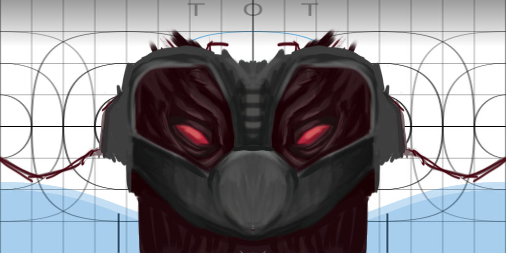
Back to art. Need sometime to warm up again butheres a bad 1st WIP for this head:
CNC
program is photoshop cs6
-----
`-` looks even worse in game:
WIP 2:
DL VEOO FOR IN GAME !!!
1

CNC
program is photoshop cs6
-----
`-` looks even worse in game:
1

WIP 2:

DL VEOO FOR IN GAME !!!
Last edited by Veoo; Sep 23, 2016 at 12:31 AM.
Reason: <24 hour edit/bump
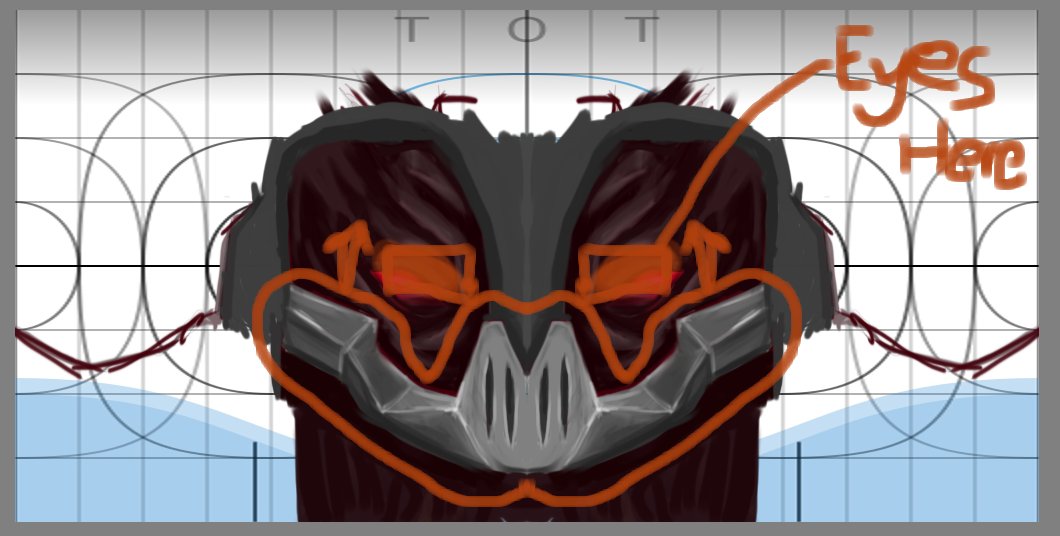
Doesn't look bad. Just need to make those eyes closer together, and possibly everything needs to be shrunk to fit better in the center.

"Dear reader, I hope this email finds you before I do."
Forumite

mask at bottom too thin. eyes too far apart. even thou your just sketching doesnt mean you cant blend as you go
use blender brushs and then touch up later with a hard blush using a hard brush 24/7 limits what you can do
peace out love calamity
use blender brushs and then touch up later with a hard blush using a hard brush 24/7 limits what you can do
peace out love calamity
changes
I still take texture requests for usd

I dont like the metal on the face. the one on the front looks too flat and looks weird with the "v" on it
The face must be REALLY small
The face must be REALLY small
[SIGPIC][/SIGPIC]
Toribash Season 1 Rank 3 | Ex-ES Artist | Ex-Mascot of [Alpha]
CLAN LEAGUE 2019 WINNER

 I use ps what type of brush do you use