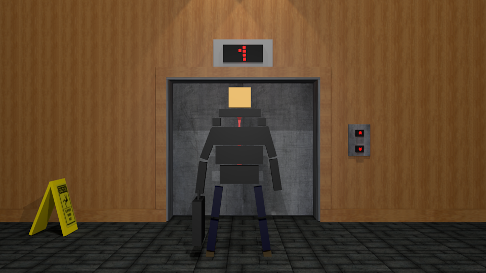
Nice work Viper 
Really love that black yellow color scheme!
The reflections don't look quite real though, not sure why. I stared out the window at some real cars to try and figure it out. Not sure how to explain it, but I think it's to do with the coloring and sharpness of the reflections and the lighting of the scene. I think on the second one the scene lighting isn't orange enough like the reflection suggests, but not sure really.
Also I like the stairwy to hell sign :P
<Faint> the rules have been stated quite clearly 3 times now from high staff
I think the text on Filipe Games looks a bit strange because it's distorted. Personally I don't like distorted text ever.
The logo itself is good though, disregarding the text.
The logo itself is good though, disregarding the text.
<Faint> the rules have been stated quite clearly 3 times now from high staff
I distorted the text for it to match the logo..
But yeah thank you
Also does it look like the unity logo?

I really don't want to copy anything..
But yeah thank you

Also does it look like the unity logo?

I really don't want to copy anything..
I guess it looks a little like the unity logo, but not enough for anyone to think you copied.
<Faint> the rules have been stated quite clearly 3 times now from high staff


