Original Post
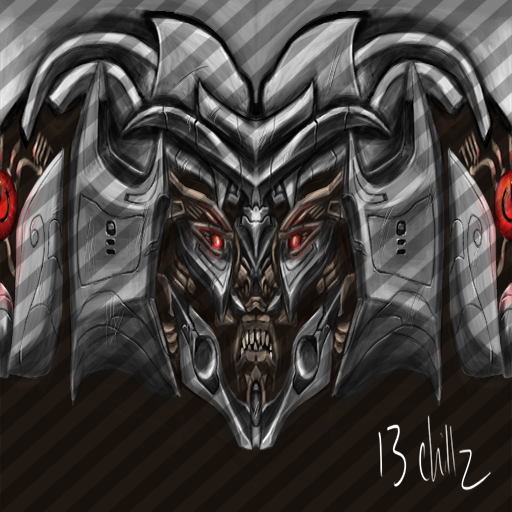
Holeh shit man
Looks litterally amazing
i can't realy complain about annything
maybie a tiny bit to large nose areaЈ
but that's it
realy good job 9/10
Oh and also, i don't realy like how a robot has teeth
i would sugest doing a metal plate with symbols over that area instead
but it's the requester and you'rse call
hope you finish this

Last edited by Xioi; Jun 24, 2013 at 11:50 AM.
Jun 2, 2023 - .best. day. ever.
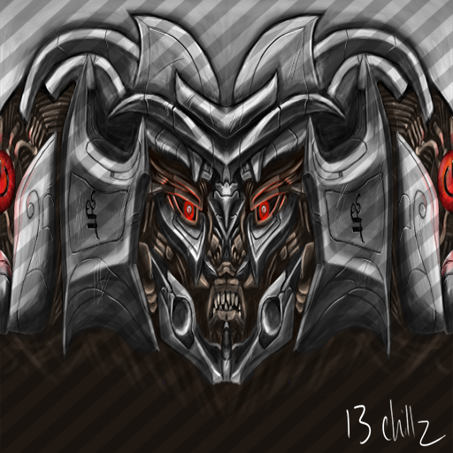
looks like you got lazy with the drawing work around the top area, its just not the same as quality as the rest.
your lines are a little too soft, harder lines, harder angles with more precise shading work.
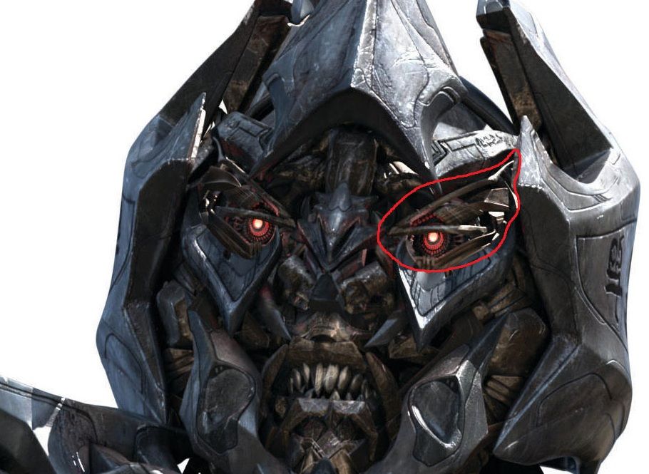
design around the eyes is boring, that <.> eyes are so 2009.
the visable brown area is too smooth, i dont want to see a blank background.
Needs more contrast in the metal shading, looks like plastic or clay. less black shades and more pure white highlights. the black should be less common, should only be used to make certain shadows really pop.
clearer definition between the highlights and the shadows.
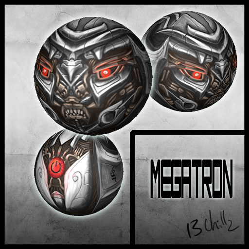
some of the shapes dont feel natural, however, I dont know how it looks on the sphere, maybe it was intentional, i dunno.
but mostly emphasis on the harder lines and angles, more clarity between light and dark, less black, more white, subtle but strong shadows and bright and vibrant highlights..
i found the shadows in the red highlited areas and highlights in the blue highlighted areas just not strong enough.
and the lines not sharp or crisp enough.
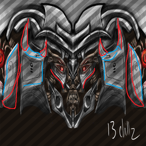

-=Art is never finished, only abandoned=-
Everything that Ben said
Also there's a seam in the middle
8/10
Still a lot better than most heads on here
Just needs a little work
Also there's a seam in the middle
8/10
Still a lot better than most heads on here
Just needs a little work
[SIGPIC][/SIGPIC]
~ raku ~ Team Girl Scouts ~ Clan League 2013 Champion ~ Duelist ~
Prince
Fucking
Ravioli
another thing:
the line of the plates of the sides(indicated by the green on the left) would not look so great on the sphere. you want to exaggerate them more to make the lines noticable and attractive on sphere(indicated by green on the right)
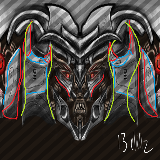
big vertical lines on the sides dont often work, the lines need to be almost moulded to the sphere.
which is why you see so many lines that work around the circles on the template
like leonardos latest texture: http://forum.toribash.com/showthread.php?t=412791
matching circles with the sphere is just so much more effective than using long vertical lines.
So when using vertical lines, it helps to keep them shorter or incorporate them into curves.
the line of the plates of the sides(indicated by the green on the left) would not look so great on the sphere. you want to exaggerate them more to make the lines noticable and attractive on sphere(indicated by green on the right)

big vertical lines on the sides dont often work, the lines need to be almost moulded to the sphere.
which is why you see so many lines that work around the circles on the template
like leonardos latest texture: http://forum.toribash.com/showthread.php?t=412791
matching circles with the sphere is just so much more effective than using long vertical lines.
So when using vertical lines, it helps to keep them shorter or incorporate them into curves.
Last edited by BenDover; Jun 24, 2013 at 04:04 PM.
-=Art is never finished, only abandoned=-


