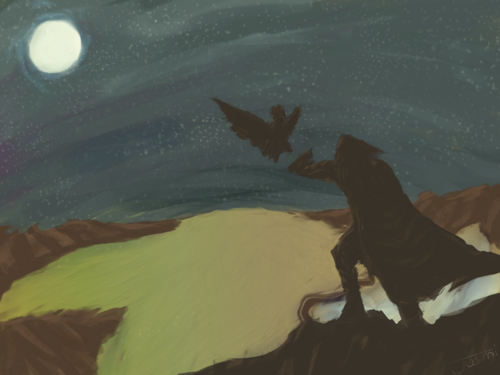
nice work of expression,
but work more on the eyes expression,
It is hard to make something strong if not working together.
the wrinkles needs a little adjustment
Look:

I see you working correctly at directions, but placement is off.
I made some scratches in orange, and shadows are strange, if you are not working with shadows, then you have to work.
As you can see the muscles of the face contracts showing wrinkles from the nose to the jaw, try it, You should know more about the form of the face,
It should be hard to make it the style you wish.
but work more on the eyes expression,
It is hard to make something strong if not working together.
the wrinkles needs a little adjustment
Look:
I see you working correctly at directions, but placement is off.
I made some scratches in orange, and shadows are strange, if you are not working with shadows, then you have to work.
As you can see the muscles of the face contracts showing wrinkles from the nose to the jaw, try it, You should know more about the form of the face,
It should be hard to make it the style you wish.

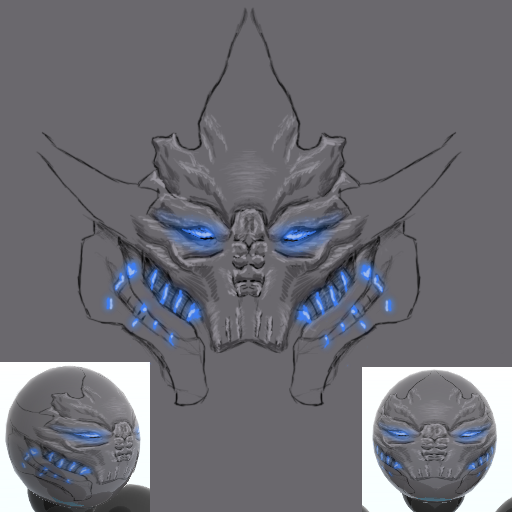
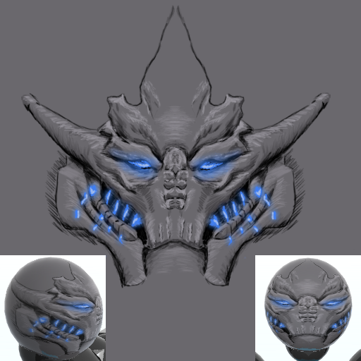
You all totally skipped him omg:

Cropped man. Too much boring space on the sides. Looks like you sharpened this thing too much as well. Text is distracting. Could use some more effects for flow. Pretty decent I suppose.
Cropped man. Too much boring space on the sides. Looks like you sharpened this thing too much as well. Text is distracting. Could use some more effects for flow. Pretty decent I suppose.
Originally Posted by dengue

but work more on the eyes expression,
It is hard to make something strong if not working together.
i disagree, i thought the eyes carried alot of character and expression, and that the lines remained consistant throughout the texture, so everything fit together quite nicely
Originally Posted by dengue
the wrinkles needs a little adjustment
Look:
I see you working correctly at directions, but placement is off.
I made some scratches in orange, and shadows are strange, if you are not working with shadows, then you have to work.
i dont disagree with you about the wrinkles, but with the hard sketch lines, its going to make him look like an old man, and i dont want that. so id prefer to leave them out entirely, rather than making it accurate at the cost of making it look bad.
ive never hid that i prefer design over technique/accuracy, and have always encouraged improvement in technique/accuracy only when it will enhance the design.
shadows and highlights arent an issue, because its not a classical/traditional style, so classical/traditional aspects arent the focus.
its just meant to be impressions, not perfectly accurate shading. it does not go with the image i had in my head.
initially i didnt want to use highlights/shadows at all in this piece.
Originally Posted by dengue
As you can see the muscles of the face contracts showing wrinkles from the nose to the jaw, try it, You should know more about the form of the face
you forget that I used to give the exact same comments to you when you started, I know how the muscles in the face/body work
Originally Posted by dengue
It should be hard to make it the style you wish.
again, i disagree, i think ive achieved the style i was looking for. it can still be improved, but its there.
thankyou for your comments
-=Art is never finished, only abandoned=-