ES Recruitment Drive
Re: My logo
Originally Posted by Shade
Psychz, your logo is too big..... and quite easy. Make it more complex! I love zaarocks, now THATS a logo!

Its more the "Z" part that is the logo.
Re: My logo
something about it i really dont like, probably the "cleanliness" of the colors, and the dragonballZ type "z"
Re: My logo
LOL i made the Z, but yea it sucks i know, but im making a new one, so keep a look out for Z logo mk. 2!
Re: My logo
Wow Zaarock, never cease to amaze me. Great work, I'm excited to see how it looks finished.
Re: My logo
Originally Posted by Shade
haha, critisism from psychz? how ironic...

Your things isn't exactly perfect either...
Re: My logo
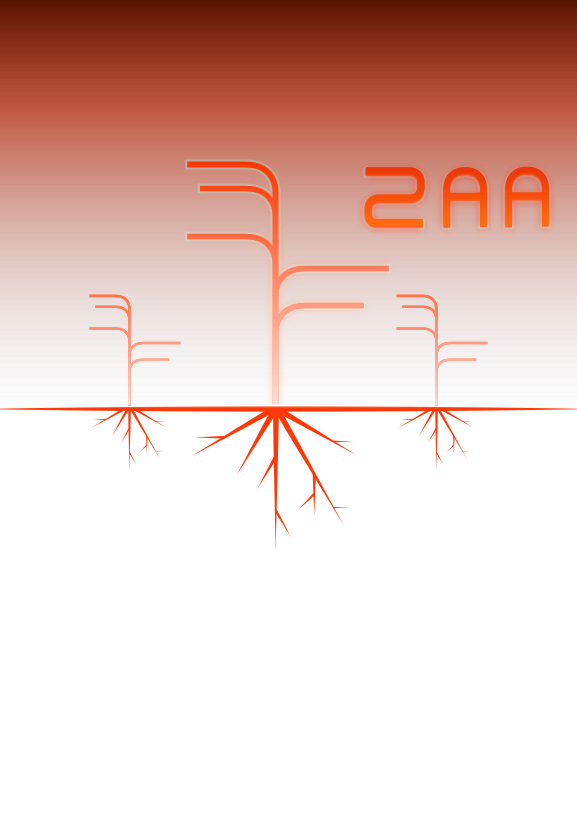
Also, another work in progress:


All done in vector, I found out theres a filter window in lineform. Gaussian blur, crystallise and fake color used here.

and no, im not gonna turn into a person who does things mostly by using filters, like certain other people...