

Original Post


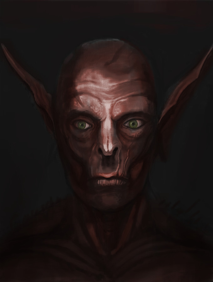
Drawing Im working on.
large image

Started using the square brushes, kinda like them. I havent drawn in so long, so I kinda felt like just doing something simular to what I have done before.
Made in photoshop, about 3 hours so far.
What can I say? It's amazing so far. I like the saturated colors of the shadows and the spotlight on the face. Square brushes are very cool but I still have to learn how to use them.
Now that I think about it there's one thing that distracts me about the drawing: the eye on the right side. It seems out of place, a bit higher than the other one and it gives a different feeling. Probably it's the fact that you can see the top of the iris and that there are less skin folds around it.
Now that I think about it there's one thing that distracts me about the drawing: the eye on the right side. It seems out of place, a bit higher than the other one and it gives a different feeling. Probably it's the fact that you can see the top of the iris and that there are less skin folds around it.
yeah I agree, changed the eyes a bit. Also I like saturated colors, but the whole thing just got a bit too far in the red zone.
some progress
looking great man; i just see some minor issues
right now, the light source looks like its small and coming from the front. With that in mind,
*the nose shading definitely needs some changing.
*the form of the eye needs to be more defined imo
*the eyes needs a stronger highlight considering the light source and since it is a very reflective surface
*the creases / scars could be a bit more subtle (especially in between the nose cartilage) or could use some change in shading
i might be being too nitpicky xD
best item forogerer
[SIGPIC][/SIGPIC]
[SIGPIC][/SIGPIC]
UGUU~~~~

