

Original Post


Tori renders! Hooray
Hello everyone, Oopyuman here,
This is something I've been doing lately, I got most of these in the art thread but...didn't seem to get many replies with any criticism, anyways, they are here:
And last, but not least:
This is something I've been doing lately, I got most of these in the art thread but...didn't seem to get many replies with any criticism, anyways, they are here:


And last, but not least:

I know that yellow-jointish tori in the last pic from somewhere... :o
Anyways, they are awesome.
Ok, now to the cnc part
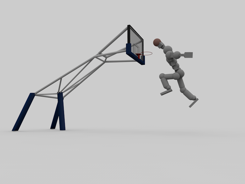
Pic 1: I'm pretty sure those baskets usually look different (the whole construction thingy etc) and the way how the tori is "moving" seems wrong. I mean, you don't look like this if you jump
Also, with some editing of the pic in Gimp or Photoshop you could have added some blur in order to make it look more dynamic.
Pic 2: The left wrist is located in the right elbow joint, you should fix that. Also if you look at the pic, you'll see the shadow of the head of the guy who took the pic, which means that there is also a light source somewhere behind him, so the tori should also have some reflections on that side
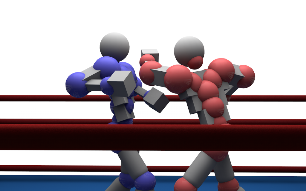
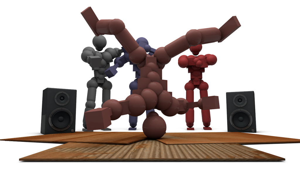
Pic 3: That one is actually my favorite one, you also could have improved the dynamic feeling of it with some blur and stuff and you also could have added some kind of enviroment around them
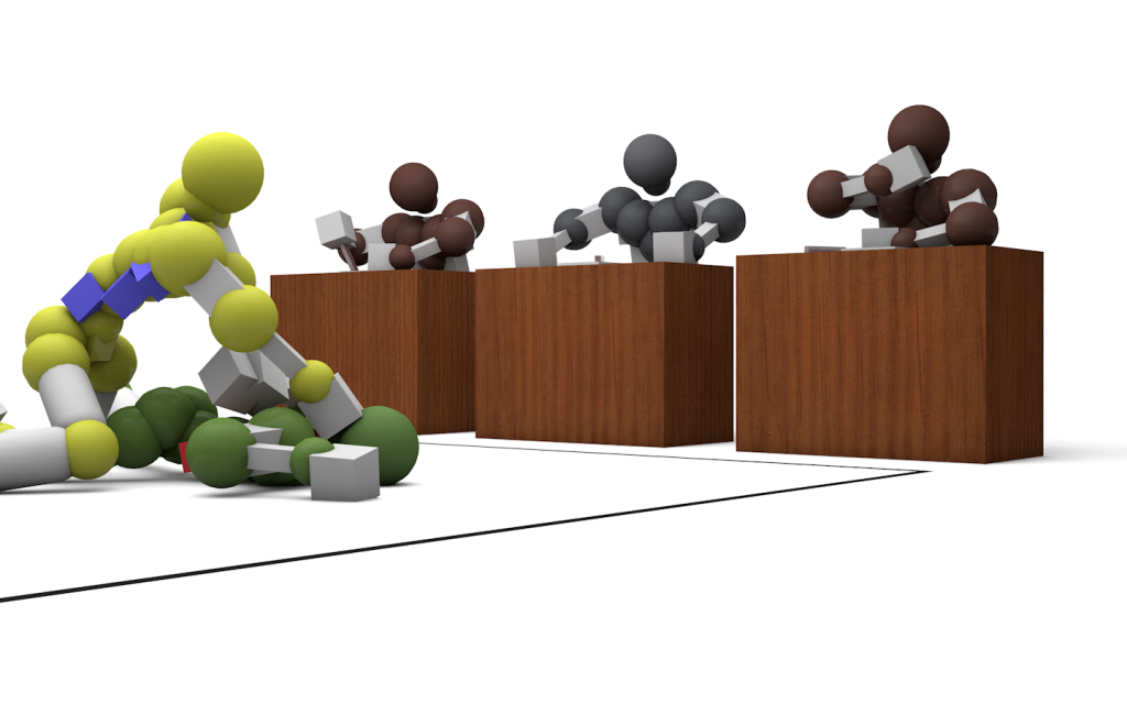
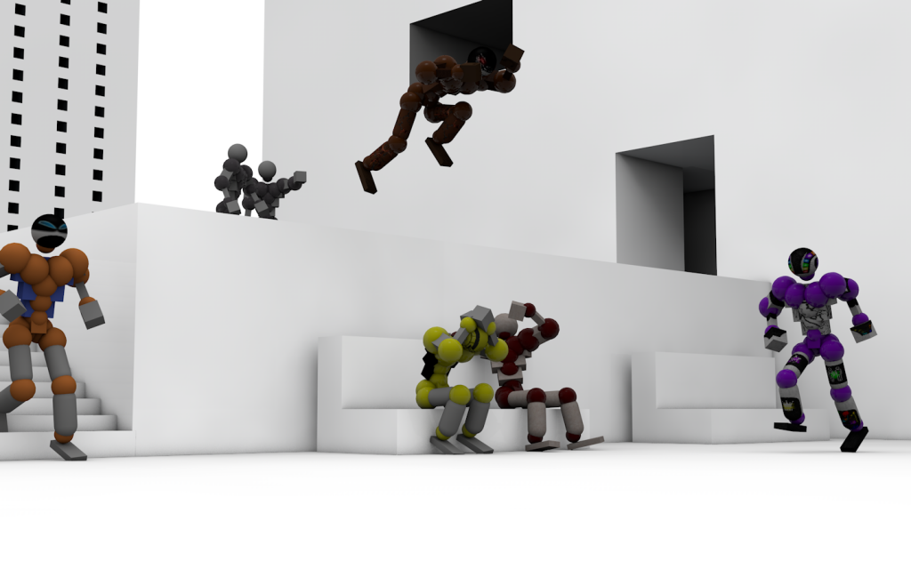
Pic 4: I think some kind of houses in the background would have been great, you also have moved the arms of the red tori in the background wrong since you can even see a part of the left arm in the right wrist
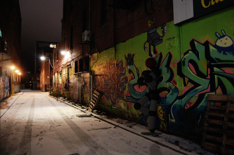
Pic 5: I think you should add a sky here and also my right foot is diving into the ground, which also looks a bit strange
Anyways, they are awesome.
Ok, now to the cnc part
Pic 1: I'm pretty sure those baskets usually look different (the whole construction thingy etc) and the way how the tori is "moving" seems wrong. I mean, you don't look like this if you jump
Also, with some editing of the pic in Gimp or Photoshop you could have added some blur in order to make it look more dynamic.
Pic 2: The left wrist is located in the right elbow joint, you should fix that. Also if you look at the pic, you'll see the shadow of the head of the guy who took the pic, which means that there is also a light source somewhere behind him, so the tori should also have some reflections on that side
Pic 3: That one is actually my favorite one, you also could have improved the dynamic feeling of it with some blur and stuff and you also could have added some kind of enviroment around them
Pic 4: I think some kind of houses in the background would have been great, you also have moved the arms of the red tori in the background wrong since you can even see a part of the left arm in the right wrist
Pic 5: I think you should add a sky here and also my right foot is diving into the ground, which also looks a bit strange
Pic 1: I'm pretty sure those baskets usually look different (the whole construction thingy etc) and the way how the tori is "moving" seems wrong. I mean, you don't look like this if you jump
Okay, okay, well I shouldn't even have posted that pic, it's a really early test, it pretty much sucks (The hoop was taken from the program's library of models)
Pic 2: The left wrist is located in the right elbow joint, you should fix that. Also if you look at the pic, you'll see the shadow of the head of the guy who took the pic, which means that there is also a light source somewhere behind him, so the tori should also have some reflections on that side
Yeah, I've always had problems with the arms crossed thingy, I'll fix it...sometime
Pic 3: That one is actually my favorite one, you also could have improved the dynamic feeling of it with some blur and stuff and you also could have added some kind of enviroment around them
It's weird because it's everyone's favorite one, the blur is easy to do, I can even do it from the same program, but the environment is quite the problem.
Pic 4: I think some kind of houses in the background would have been great, you also have moved the arms of the red tori in the background wrong since you can even see a part of the left arm in the right wrist

There, you happy? Still, I should add some buildings and I will probably do soon, and remove the text, the picture was initially for a video of Mocucha (The one jumping in the last pic)
Pic 5: I think you should add a sky here and also my right foot is diving into the ground, which also looks a bit strange
There is a sky, and yeah, I'll fix your foot, the pic is still a WIP, got lots to do in it.
And I'm pretty sure you missed one pic, the one with 'aikido' and judges
P.s. Why aren't you on skype anymore?
Last edited by Sluup; Apr 12, 2013 at 11:31 PM.
