Ranking
Original Post
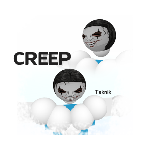
[TEX] Significantly creepy Head.
Here is a head I made for ExtHour's set request. I felt really good about it but it feels too simple. Even for a simple head. I was wondering is there anything I should add? Or Fix?

reference


head wip


2nd wip


Oh and i forgot to mention it's a wip so far. That's why I need the advice.
Thanks for the CnC.
Last edited by Teknik; Jan 17, 2012 at 04:01 PM.
My heart just wouldn't be in it, you know? haven't got one.
Its a Work in progress (: I was mostly asking how I can improve or fix what is already there.
My heart just wouldn't be in it, you know? haven't got one.
Originally Posted by Teknik View Post
Its a Work in progress (: I was mostly asking how I can improve or fix what is already there.

Maybe some more shading, for a realistic look
U could use some fuzzy brushes.
Originally Posted by 00naruto00 View Post
]

Maybe some more shading, for a realistic look

True, but I'm trying to keep the shading to moderation because whenever I do it I usually screw the entire thing up. Just tiny shades like the ones on the eye and nose. But I'll definitely add more as I go along. And For the fuzzy brushes, Im trying to keep it sharp and cartoony while also trying to have some detail with a bit of shading. So I'm not going to use fuzzy brushes, just the pentool.
My heart just wouldn't be in it, you know? haven't got one.
The dark grey shade under the nose, it's weird.
<Marco> and then Oblivion tried to sexually assault me
<Oblivion> and Marco wasn't surprised at all
You mean the dark tip? Yeah thanks, I should change that. Doesn't blend very well.
My heart just wouldn't be in it, you know? haven't got one.
My turn now?

From what I can see in the wip, the nose is a bit too large in my opinion, although the teeth are really impressive, i like the eyes, but I think they should be a bit darker and some parts of the lower lip section might be a little bit too thin.

^^
Well I actually wanted the nose to be big because its smack in the middle of his face. But I guess I should shrink it a bit. The lips are a bit screwed up because I resized them alot to fit. I'll fix it in later versions. Thanks for the critique ; )
My heart just wouldn't be in it, you know? haven't got one.
fat face, especially seeing the reference youre using.

nose is... interesting. at first i thought the ball shape thing at the bottom was his lip, might wanna think about being a little more accurate with it.

love how you're drawing it though, the lines and style on the nose definately has a good vibe going on.

rad work on the teeth and eyes
-=Art is never finished, only abandoned=-