Ranking
Original Post
[TEX].

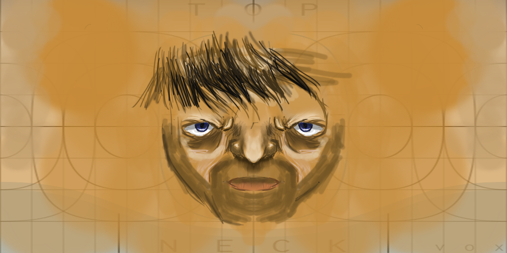
head


what should I do with this work in progress??

program: Autodesk.
Last edited by 0029; May 5, 2016 at 05:12 PM.
what the fuck are those proportions lmao does he have down syndrome

the shading is ok-ish but the cheeks don't make sense
Ahhh fuckk!!3)it’s 2LIT . >>>>
Originally Posted by cats View Post
what the fuck are those proportions lmao does he have down syndrome

the shading is ok-ish but the cheeks don't make sense

is it that bad? maybe I should give up on art.
You can open this when you add the programs.
Originally Posted by Kaneki333 View Post
I'm Brazilian, i'm alredy fucked every day i wake up

Originally Posted by TyZi View Post
You can open this when you add the programs.

chill out, you don't close plenty of art threads without program names...

here are a few:

http://forum.toribash.com/showthread.php?t=559509

http://forum.toribash.com/showthread.php?t=558901

http://forum.toribash.com/showthread.php?t=559905
Last edited by 0029; May 5, 2016 at 05:18 PM.
the face shading is quite nice, but those hair work is a bit wonky
work on that one
"0h no" -Trice
A.K.A Tricerafi || Thanks Papa Donut, bless you
It's a wip. Not much to comment on when it comes to color or shading. The eyes seem very spaced out. I'd make them closer. But can't tell at the moment since it isn't mapped on a sphere. Show us some in game shots.

"Dear reader, I hope this email finds you before I do."
I like the idea, use of colors, and shading. The rough sketch is also pretty appealing.

But...like most people already stated, it may be of your best interest to fix the facial structure a bit.

The things that are the most noticeable are probably:

#1: The eyes are way too far apart. Unless you want to have eyes on the side of your head, push em' together a tad.

#2: The nose is kinda big. So are the lips. Make sure to look at your flat in a sphere to get a hold of your proportions.

#3: The chin. Just work on it

Keep at it bro!
Last edited by FruitCandy; May 6, 2016 at 01:21 AM.
fruitcandy criticised well.
I will add some stuff to help you better.
you did fine for a first time showing heads,
you made this promising yet raw.
I will use the image for tha sake of learning, no show off purpose.
the eyes of humans are about one eye spaced, try to put eyes close together.
[/IMG]
if you want to get a real reference, try to put a good proportional copy of a human head mapped on sphere.
this image shows jared leto head, look how the eyes are one eye spaced and how the ear is at the end of the front look(You can put more to the side of the side look).
other thing is the nose, you can put eyes measuring forehead and chin, and so define the nose, look on the image( I missed some proportions, but the same space is from the forehead to the eyebrows to the nose and to the chin).
Dont make all heads pale and blank, you can messed with propotions and make strong expressions to get a emotion feel of your head, make to sure to make it fit well on sphere.
keep doing it if you wish, you have talent.