Ranking
Originally Posted by 13chillz View Post
Then to further that, should we be telling veoo to go for more than two colors or not?

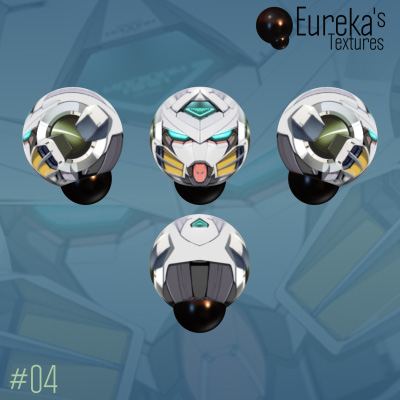
Well, I think its probably best for me to figure out how to make a good robotic head with 2 colors so I dont end up learning to make good heads with crutches that make them worse

I feel like I did the same sort of thing with horror heads --- I learned to make goods ones but a lot of it was just on the crutch of TONS of detail.

I think I should start with 2 colors and once I get to clockwork8/13chillz(YOUR) level I can expand out and have fun with more colors

just imo.

what do you guys think?

:v
We still have yet to finish debating if more than '2' colors is a crutch.


Ok different thought does anyone remember who was making those 'anime' style robot heads. I thought they had more than a couple colors and were pretty cool
Originally Posted by 13chillz View Post
We still have yet to finish debating if more than '2' colors is a crutch.


Ok different thought does anyone remember who was making those 'anime' style robot heads. I thought they had more than a couple colors and were pretty cool

its all a matter of depth, if its a flat, anime style texture and not realistic, it relies on color to make it pop.

shading makes good realistic heads pop.

imo
No it had depth. And it didn't use traditional grayscale as a base I'm trying to find it.

something i made before


I wanted to make a vitiek-like head. I also watch his stuff on YT and his shit is pretty bombastic :^)

[SIGPIC][/SIGPIC]
Toribash Season 1 Rank 3 | Ex-ES Artist | Ex-Mascot of [Alpha]
CLAN LEAGUE 2019 WINNER
Originally Posted by Karstnator View Post
Also, Im using gimp and a mouse aAAAAaaa

So play with vectors if the mouse is limiting you.
But you're making good progress even with just the mouse.

Originally Posted by McFarbo View Post
I'm saying only using two colors is normally boring when there isn't enough depth to the head to accompany it, like with the gif you just posted of that head you made. Clockwork8 did a perfect blend of depth with the two colors to make the head look amazing.

Using more colours requires a more complete understanding of colour.
Adding more, when ones understanding is not complete enough, does more harm than good.
More colours = more variables to balance.
If you can pull it off, balancing it, not overcluttering it and keeping it consistent, then great.

Originally Posted by Karstnator View Post

something i made before


I wanted to make a vitiek-like head. I also watch his stuff on YT and his shit is pretty bombastic :^)

Nice, would consider tapering in that centre bit a bit more in the centre or just above, its a bit, elephant trunk like.
Nice work with the overlapping and using high and low.
Colour is also pretty effective, creates interest and pulls focus well, that flat bit in the middle is just a bit too much negative space, breaks the flow.

Good progress.
-=Art is never finished, only abandoned=-
Originally Posted by 13chillz View Post
No it had depth. And it didn't use traditional grayscale as a base I'm trying to find it.

Ok, Ill be interested in seeing it.


Originally Posted by Karstnator

something i made before


I wanted to make a vitiek-like head. I also watch his stuff on YT and his shit is pretty bombastic :^)

uhhh looks like you just made a shitty version of this (also you're using bombastic wrong lol):

blah

Last edited by Veoo; Nov 28, 2017 at 12:16 AM. Reason: dicks
Originally Posted by 13chillz View Post
Ok different thought does anyone remember who was making those 'anime' style robot heads. I thought they had more than a couple colors and were pretty cool

The Gundam styled ones?
I think so, he used white and blues and pinks and stuff?
Worked in like, 1028x1028?
I know avwave dabbled, but I dont think its the same person we have in mind.
That was some hot shit.
-=Art is never finished, only abandoned=-
Dude's help. I wanna join the org to learn art but at the same time we need example of our arts to enter.
Find me ingame and duel me