

Original Post


[Art] Old Candy
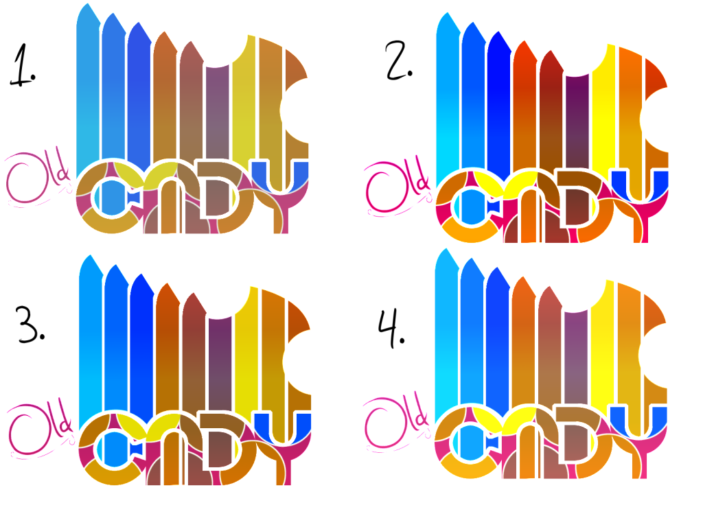
So while i was trying to fall asleep last night, i had this little logo pop into my mind. Don't know where i got the idea from, but i visualized a vector type logo for like a candy company or something.
Anyways, here is what i came up with. I did 4 different contrast cause i couldn't decide on one i liked the best. Feel free to tell me your favorite version and cnc is always appreciated.
Made by Doxxy.
Used Gimp and a mouse.
Anyways, here is what i came up with. I did 4 different contrast cause i couldn't decide on one i liked the best. Feel free to tell me your favorite version and cnc is always appreciated.
"Old Candy: Flavor has never been so nostalgic
Made by Doxxy.
Used Gimp and a mouse.

Kind of retro looking... But the contrast is too strong...Working on something retro myself atm, fucking hate it.
I would keep the font a solid color, as it is quite annoying to look at as it is.
I like the idea, but not what you did you the "strokes" going up, could you explain the random pieces that has been removed? Why not keep them?
I would keep the font a solid color, as it is quite annoying to look at as it is.
I like the idea, but not what you did you the "strokes" going up, could you explain the random pieces that has been removed? Why not keep them?
Old cady, old cady, old cady. Nothing helps, all I can see is that, washed in nice colors.
Maybe redesign the candy word logo?
Maybe redesign the candy word logo?
