leonardo:
looks ok, cute viking cartoon
very cute viking cartoon.
decent head
katsudon:
why are the spikes pointing downwards? position on the sphere shows that they should technically be pointing only slightly upwards?
otherwise its ok, decent styling
vog:
technically a decent texture, proportions are fine, and styling is good.
it just... lacks something, perhaps a bit more contrast in the creases to make the eyes stand out
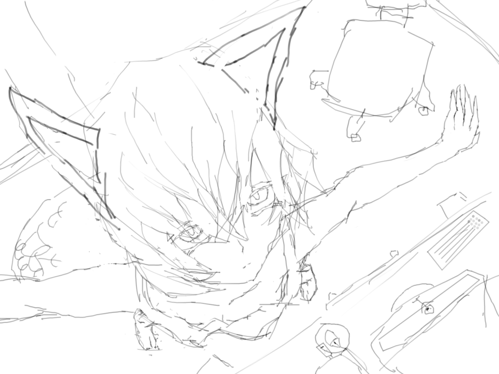
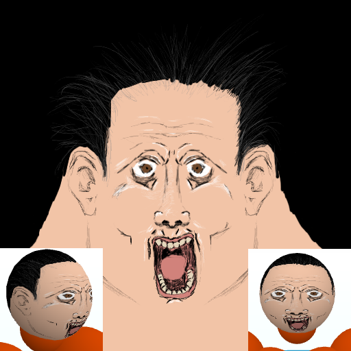
Heres a WIP from me
still in sketch phase atm
flat looks terrified, ingame looks excited, think its something to do with the angle change on the mouth from flat to sphere.
so im going with the excited psycho killer bro. finished vers will prolly have some sort of blood somewhere, dirty and grungy looking or something
pretty satisfied how its going sofar, getting used to this tablet thing
drawing technique is still very rusty, and with getting used to the tablet, may take a while to get that back, but atleast my drawing eye is still more or less the same, mapping turned out nicely
note:
I seem to be lacking on ideas for hair, any input on that would be most welcome
hair design for realistic faces seems so limited on this sphere, basically a bieber cut, emo or bald
prolly gna end up being something like one of these:
http://cdn.bleacherreport.net/images...jpg?1320396263
http://4.asset.soup.io/asset/2755/6580_7a85.jpeg
looks ok, cute viking cartoon
very cute viking cartoon.
decent head
katsudon:
why are the spikes pointing downwards? position on the sphere shows that they should technically be pointing only slightly upwards?
otherwise its ok, decent styling
vog:
technically a decent texture, proportions are fine, and styling is good.
it just... lacks something, perhaps a bit more contrast in the creases to make the eyes stand out
Heres a WIP from me
still in sketch phase atm
flat looks terrified, ingame looks excited, think its something to do with the angle change on the mouth from flat to sphere.
so im going with the excited psycho killer bro. finished vers will prolly have some sort of blood somewhere, dirty and grungy looking or something
pretty satisfied how its going sofar, getting used to this tablet thing
drawing technique is still very rusty, and with getting used to the tablet, may take a while to get that back, but atleast my drawing eye is still more or less the same, mapping turned out nicely
note:
I seem to be lacking on ideas for hair, any input on that would be most welcome
hair design for realistic faces seems so limited on this sphere, basically a bieber cut, emo or bald
prolly gna end up being something like one of these:
http://cdn.bleacherreport.net/images...jpg?1320396263
http://4.asset.soup.io/asset/2755/6580_7a85.jpeg
Last edited by BenDover; Apr 18, 2012 at 01:25 AM.
-=Art is never finished, only abandoned=-
Thank you :3
I put the spikes downward to try and make the helmet seem like a dragon,with wings and teeth like that. :3
Olaf One-Eye vs. Numinex :3
Hehe :3
Any tips on how to improve on the path I'm taking?
Btw Bendover, looks pretty good, can't CnC it since, I'm not too keen on what to say. :3
It reminds me of Chicken's things...I have no idea why.
Hi.
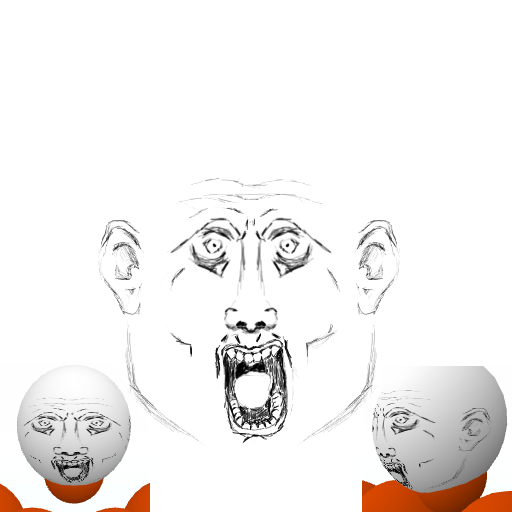
its starting to look like christopher walken

he's a crazy cat, so its fine
should probably do eyebrows sometime, been waiting till later to add them, but the lack of them is starting to annoy me
he's a crazy cat, so its fine
should probably do eyebrows sometime, been waiting till later to add them, but the lack of them is starting to annoy me
-=Art is never finished, only abandoned=-