Re: My logo.
Uh.......
All I can say is that you need keep practicing.
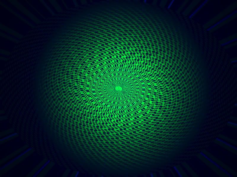
The red "x" and the text are awful! Use a font ffs.
It would also be nice if it had some transparency around the edges to give it less of a square feel.
The background is most likely the best thing on there.
Use gimp better next time. There are a lot of things you can do with it.
All I can say is that you need keep practicing.

The red "x" and the text are awful! Use a font ffs.
It would also be nice if it had some transparency around the edges to give it less of a square feel.
The background is most likely the best thing on there.
Use gimp better next time. There are a lot of things you can do with it.

Re: My logo.
Originally Posted by Ari
I used photoshop.
Omg.
So it's nothing but a distort filter and paint?
Filters suck.
This is what can be made with Photoshop.


