Ranking
:O Bleach!?

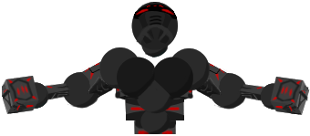
I likey, But stick the sword in the somewhere, Can't have Ichigo without his sword after all.
Originally Posted by ThYphus View Post
Pampam doublepost again because ofyou lazy non-CnC givers.


Mmh, too dark for me actually. TOO contrasted. If it wasn't in such colors, it'd be pretty cool, but high contrast kills it.

[re] | #Polska
qui hic minxerit aut cacaverit, habeat deos superos et inferos iratos
Got inspired by some Anime-Tutorials:


And something I made out of a pretty cool stock image:


Well, feedback would be awesome.
[Addicted]
wat tutorials


About Chuck Norris: it's quite nice, but lacks some life, it's... you know, boring. Maybe that's because of those unlively colors.

signature with b00bs: not bad, but in my opinion white is too white. Wonder how it looked if it was some different color, so it would be more visible. @edit also maybe some cool stuff on both sides of signature, liek, some small, not attention-drawing but filling c4d etc.

Last one: this time it lacks some action, right is packed and such, it's nice, and left is too silent, nothing out there. Also noise (whatever the effect is called, I'll call it noise, you know, on hands etc.) is a bit too strong. Aaaaaaaaaaaand could you show me the stock image? Because it kinda has a feel like not much was done to it D: [maybe I'm wrong].


If you want posts badly, just type Requesting JtanK's comment.

[re] | #Polska
qui hic minxerit aut cacaverit, habeat deos superos et inferos iratos